GIS that makes the overlooked undeniable.
Real maps, real data, real people who needed someone to notice. New ones posted here roughly every week.
Hospital Accessibility Analysis
A dashboard analyzing healthcare accessibility across Illinois, built on live cloud-native geospatial data rather than a static extract.
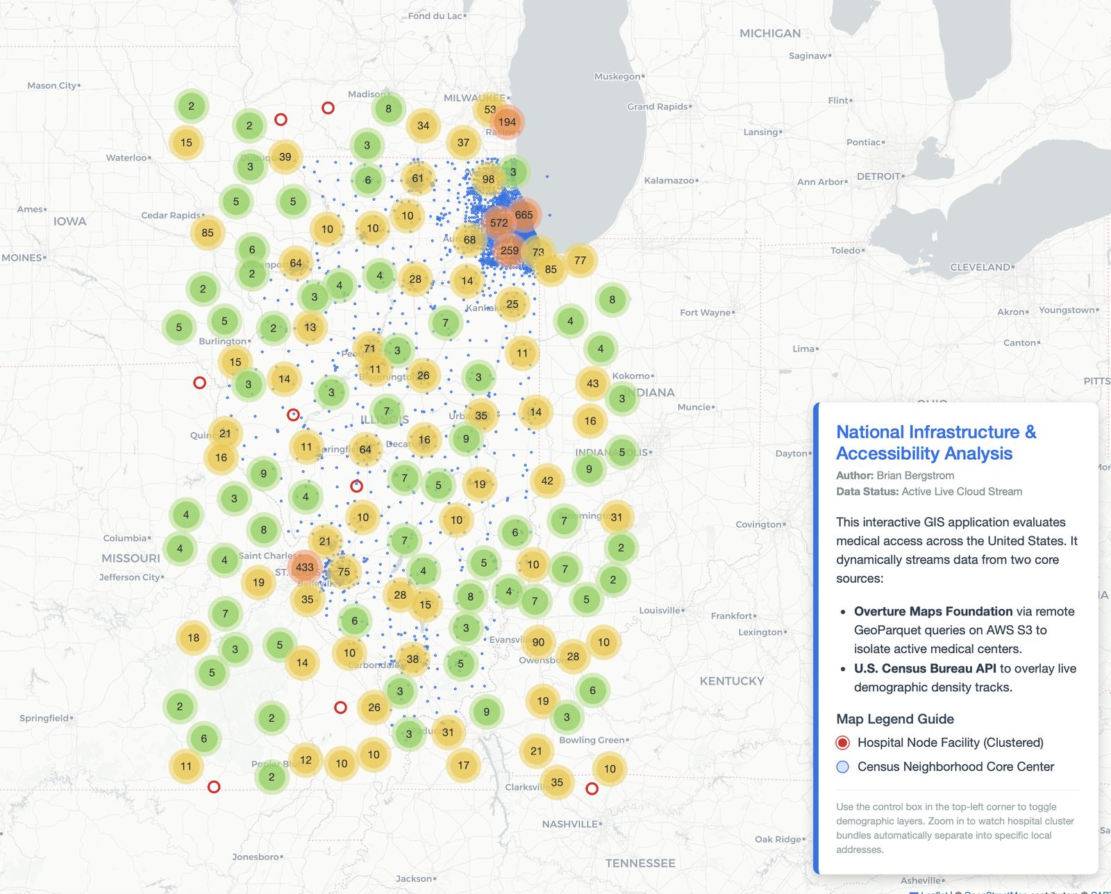
This is the most technically ambitious thing I've built during my independent study. It streams live Overture Maps GeoParquet data straight from AWS S3 — rather than working from a downloaded, aging extract — and combines it with Census tract boundary data via pygris to analyze how healthcare access lines up against geography across Illinois.
Illinois-focused, not "national"
I want to be straightforward about scope here: the intent was always Illinois. The dashboard shows data for other states too, but that's incidental — Overture Maps and Census data are both national datasets, and I haven't filtered them down. It wasn't a deliberate design choice to go national, and I'd rather say that plainly than oversell it.
How it's held up
I posted this on LinkedIn without expecting much, and it sparked real technical conversation with people in the field — one GIS developer raised the challenge of trying the same approach on Overture's much larger buildings dataset, and a senior software engineer suggested an edge-caching architecture (CloudFront and Lambda@Edge) that could make a production version more efficient. That kind of engagement matters more to me than any metric I could put on the dashboard itself.
This was the first app to migrate off dulcetgis.com onto my permanent domain, bergstromgis.com — driven by that outside validation, not just personal preference.
Live and streaming real data right now.
View the dashboard (opens in a new tab) View the code (opens in a new tab)