GIS Analyst · Chicago

GIS that makes the overlooked undeniable.

Real maps, real data, real people who needed someone to notice. New ones posted here roughly every week.

Civic work

Maps and tools built for people who are usually assumed to have a car, current technology, or money to spare — food access, mental health, transit, and healthcare.

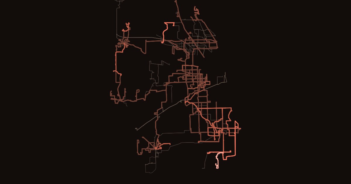
Map of Pace suburban bus routes on a near-black background, each line colored from dim brown to bright coral by the share of its scheduled trips that never appeared on Pace's bus tracker.
Civic — Independent Study

The 309 Doesn't Always Leave Elmhurst

I tracked every Pace bus for a month and checked it against Pace's own schedule. Between 1 in 94 and 1 in 53 trips never appeared, most of them in the south suburbs. At my own stop, a quarter to a third of rush-hour buses never left.

Read the story
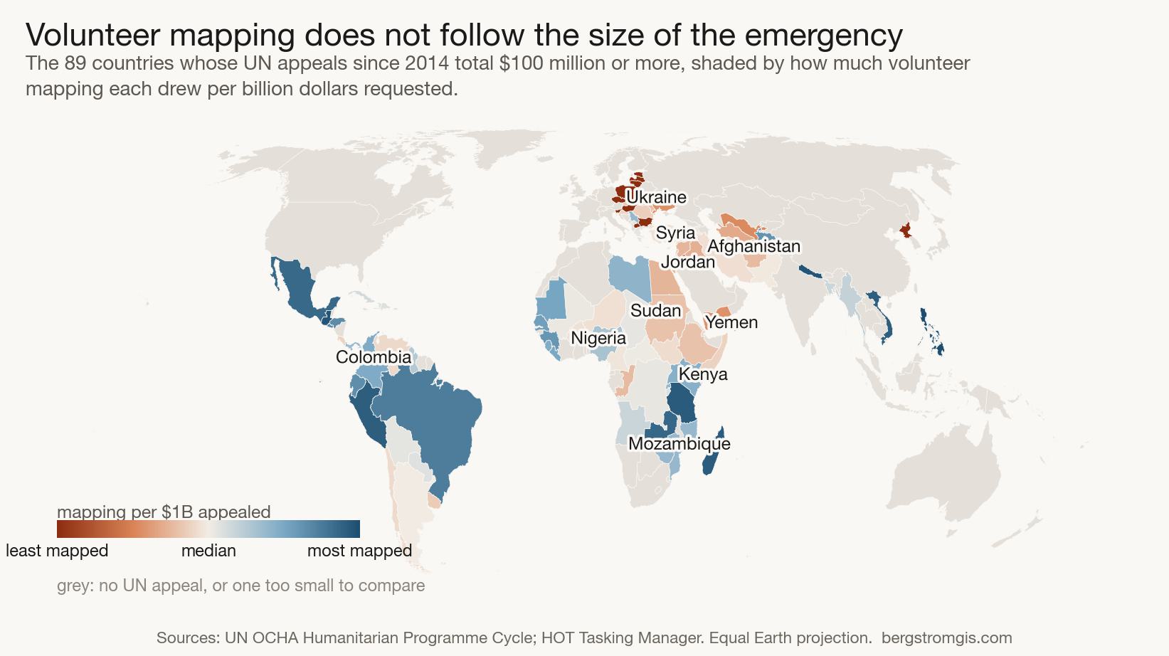
World map on the Equal Earth projection showing countries with UN humanitarian appeals shaded by how much volunteer mapping they drew per billion dollars requested. Ukraine, eastern Europe, Syria, Jordan, Afghanistan and Yemen are the least mapped.
Humanitarian — Independent Study

Where Humanitarian Mapping Happens

Joining 14,510 volunteer mapping projects against every UN humanitarian appeal since 2014 shows that volunteer mapping tracks the size of an emergency only up to a point. Among the 36 largest crises, the relationship disappears.

14,510 mapping projects, 160 countries, 532 UN appeals worth $400 billion

Read the story
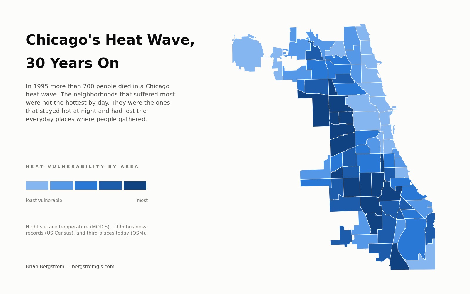
Map of Chicago's 77 community areas shaded by a combined heat-vulnerability score, with the darkest areas forming a band across the West and South sides.
Civic — Independent Study

Chicago's Heat Wave, 30 Years On

Thirty years after the 1995 Chicago heat wave, satellite thermal imagery and 1995 business records show the neighborhoods that suffered most were not the hottest by day, but the ones that stayed hot at night and had lost their gathering places.

121 satellite scenes, 110,605 rows of 1995 business records, 77 community areas

Read the story
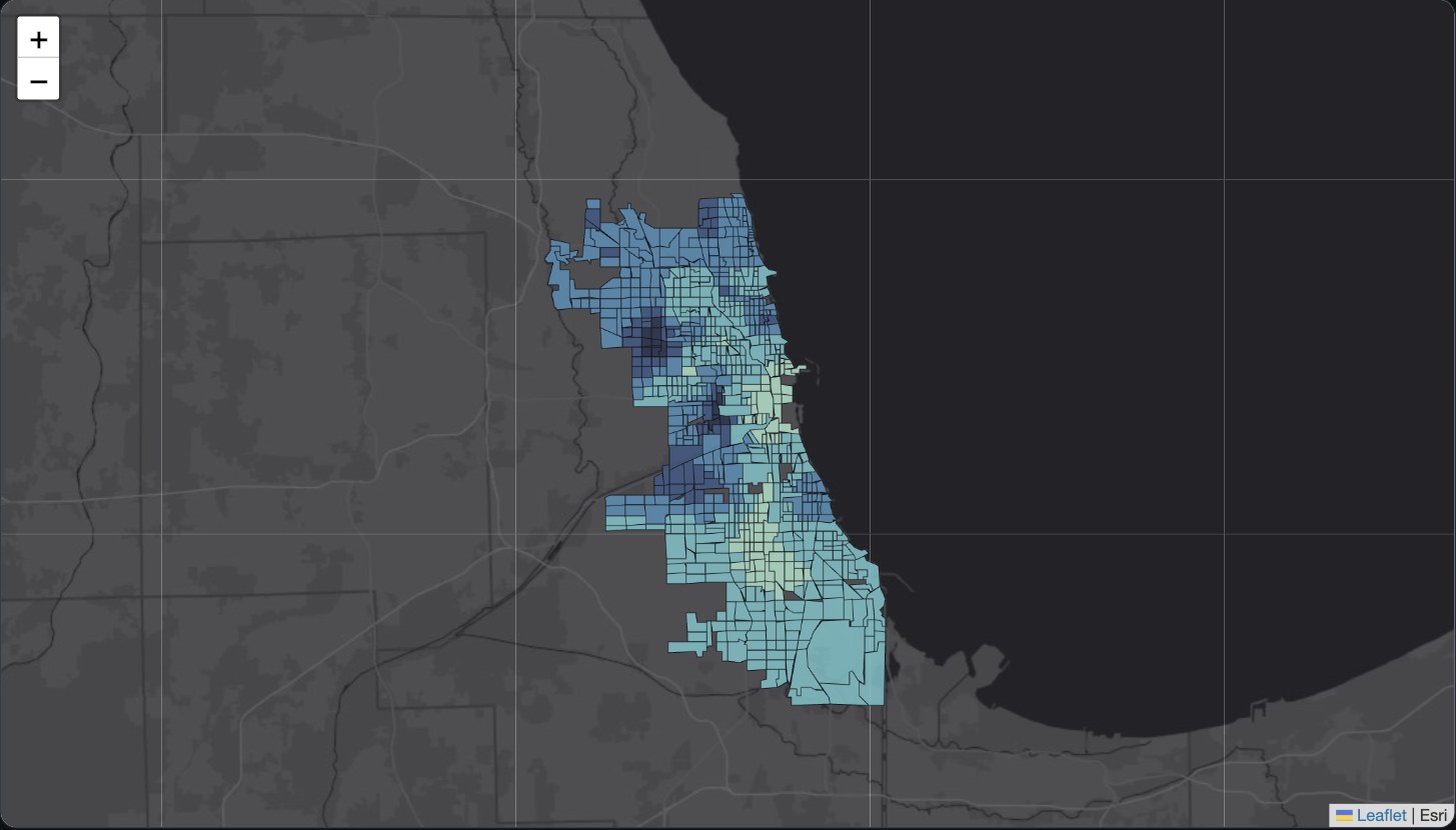
Choropleth map of Chicago census tracts colored by local model fit from a geographically weighted regression of theft.
Civic — Independent Study

Where Predictors of Crime Change Across Chicago

Replicating a 2025 PLOS One geographically weighted regression study on real, more recent Chicago crime data, to show where the real predictors of crime strengthen, weaken, or reverse across the city.

389,334 real incidents, 777 census tracts, 2023–2025

Read the story
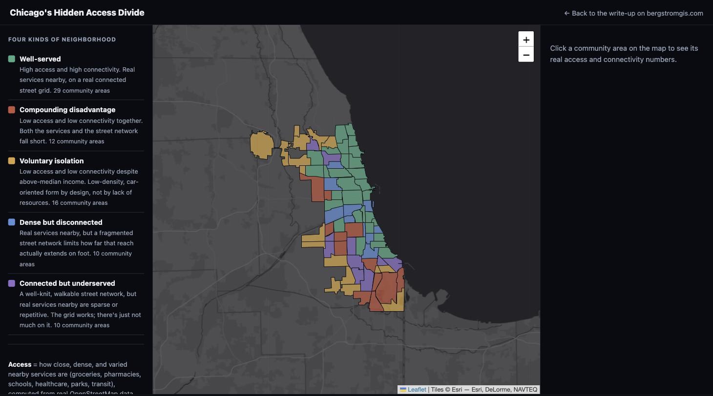
Interactive map of Chicago's 77 community areas colored by access and connectivity category.
Civic — Independent Study

Chicago's Hidden Access Divide

Replicating a April 2026 PLOS ONE street-network study on Chicago for the first time, to find which neighborhoods have real services nearby AND a connected street grid, and which have only one or neither.

77 community areas, real OpenStreetMap network analysis

Read the story
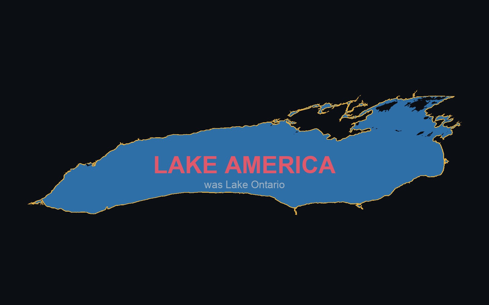
Real outline of Lake Ontario's shoreline, labeled LAKE AMERICA with 'was Lake Ontario' underneath.
Civic — Independent Study

Lake Ontario, or Lake America?

A single executive order renamed a Great Lake for U.S. Google Maps users. A real toggle map showing what changed, and why OpenStreetMap doesn't work that way.

Renamed by executive order, August 28, 2026

Read the story
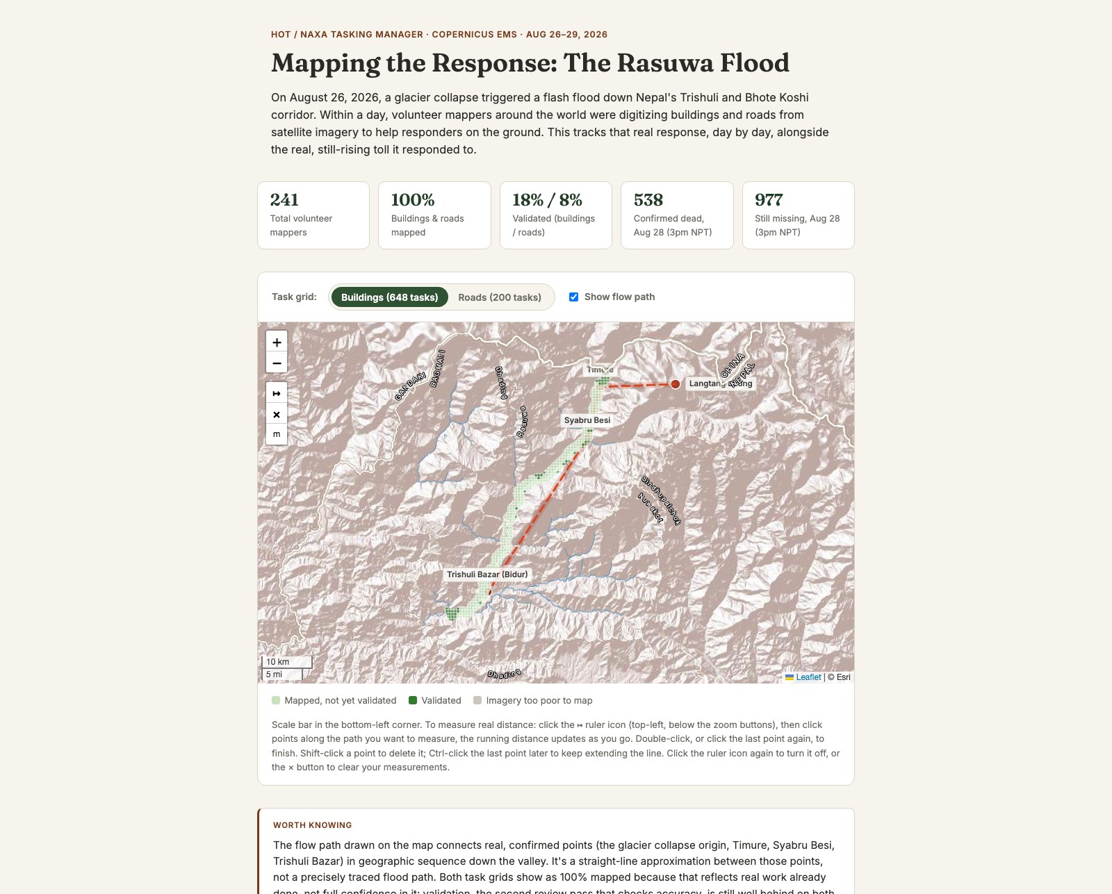
Screenshot of the Mapping the Response map, showing the HOT Tasking Manager task grid along the Trishuli valley, a flow-path line from the glacier collapse origin, and real-time stats on volunteer mappers and the reported toll.
Civic — Independent Study

Mapping the Response: The Rasuwa Flood

The real HOT/NAXA volunteer mapping response to the August 2026 Nepal flood, alongside cloud-masked before/after satellite imagery and the real, still-rising toll.

241 volunteer mappers, 848 tasks, live HOT data

Read the story
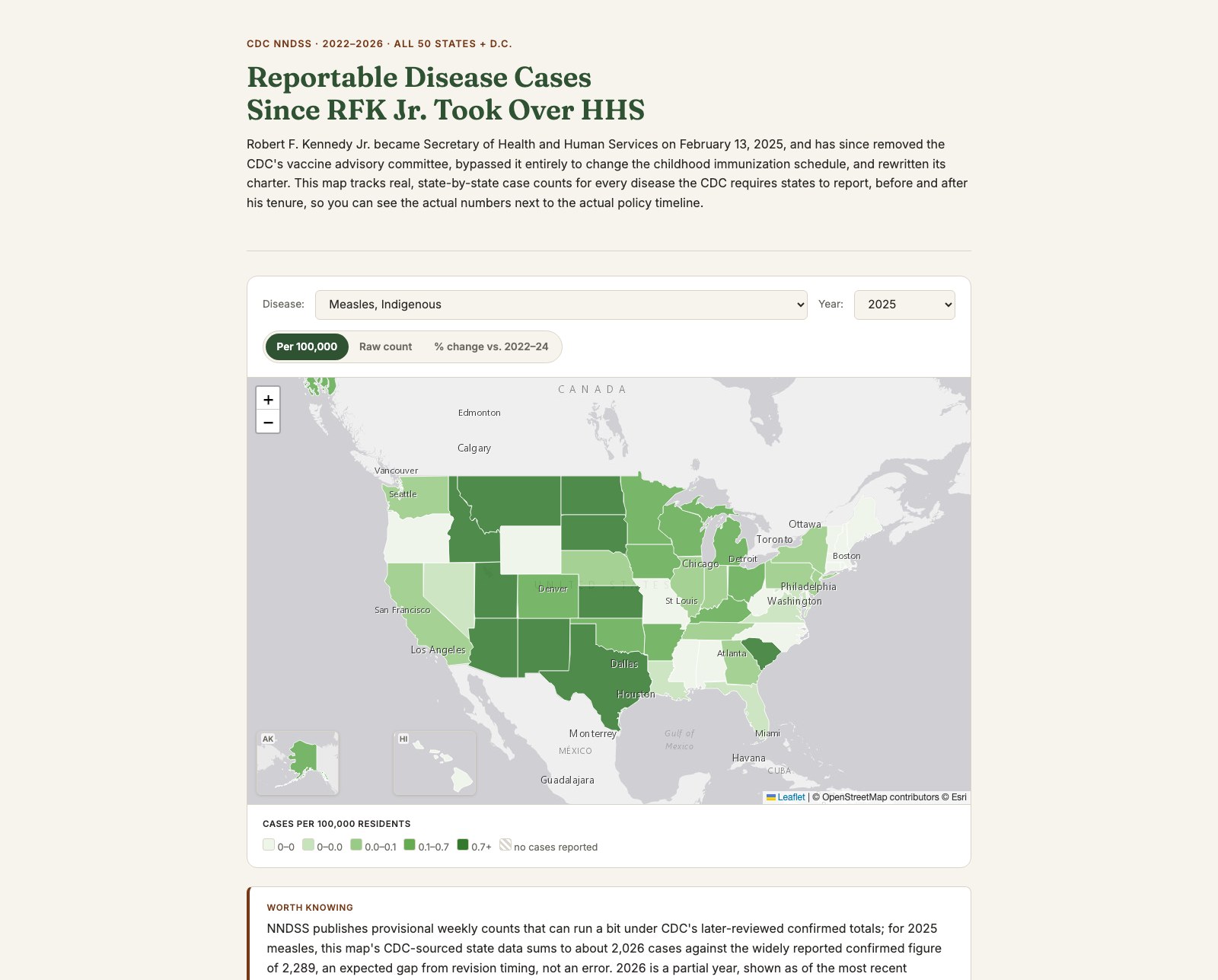
Screenshot of the Reportable Disease Cases map, showing a national choropleth of measles rates by state alongside disease, year, and metric selectors, with Alaska and Hawaii inset maps in the bottom-left corner.
Civic — Independent Study

Reportable Disease Cases Since RFK Jr. Took Over HHS

Real, state-by-state case counts for all 139 CDC-notifiable diseases, tracked against the actual dated timeline of federal vaccine policy changes since RFK Jr. took over HHS.

139 diseases, all 50 states + D.C., 2022–2026

Read the story
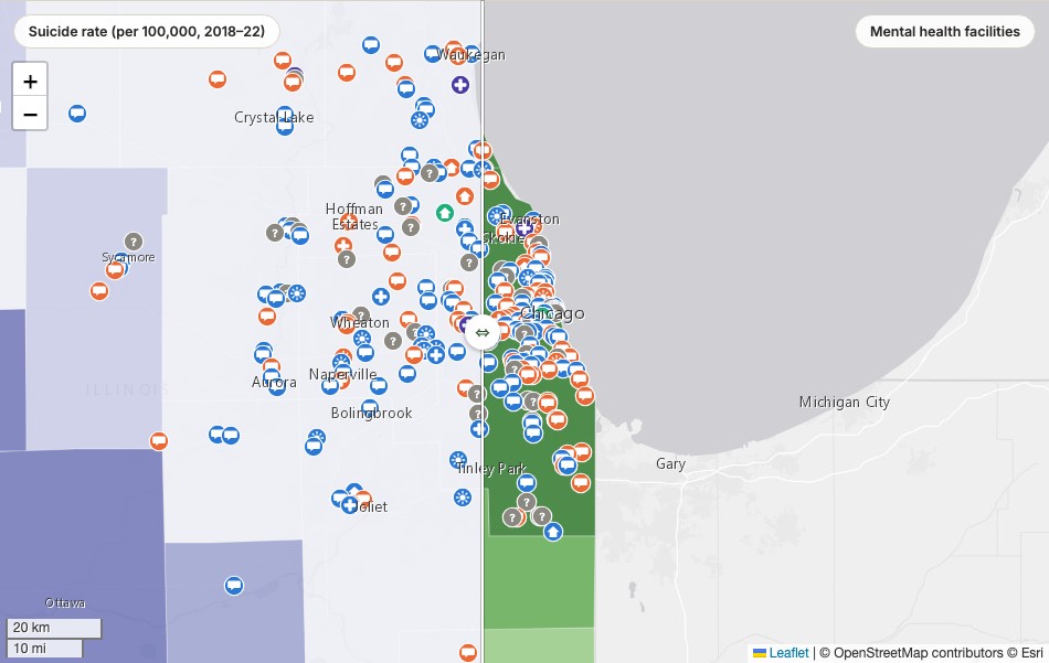
Screenshot of the Illinois Mental Health Map, a swipe comparison showing county suicide rates in purple on the left against mental health facility locations in green on the right.
Civic — Independent Study

Illinois Mental Health Map

County-level suicide rates, mental distress, and uninsured rates swiped directly against where mental health facilities actually are, all 102 counties, built for a NAMI DuPage audience.

25 of 102 counties have zero listed facilities

Read the story
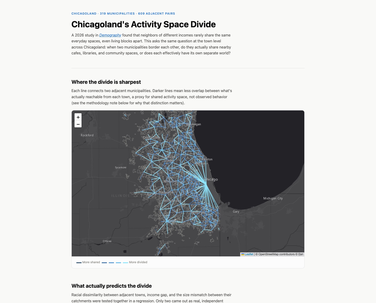
Screenshot of the Chicagoland Activity Space Divide map, showing a network of bright cyan lines connecting adjacent municipalities on a dark basemap, radiating outward from Chicago.
Civic — Independent Study

Chicagoland's Activity Space Divide

Testing a real 2026 Demography paper's finding at the town level: racial dissimilarity between adjacent Chicagoland municipalities predicts less shared activity space, independent of income.

Racial dissimilarity: p = 0.001. Income gap: p = 0.846.

Read the story
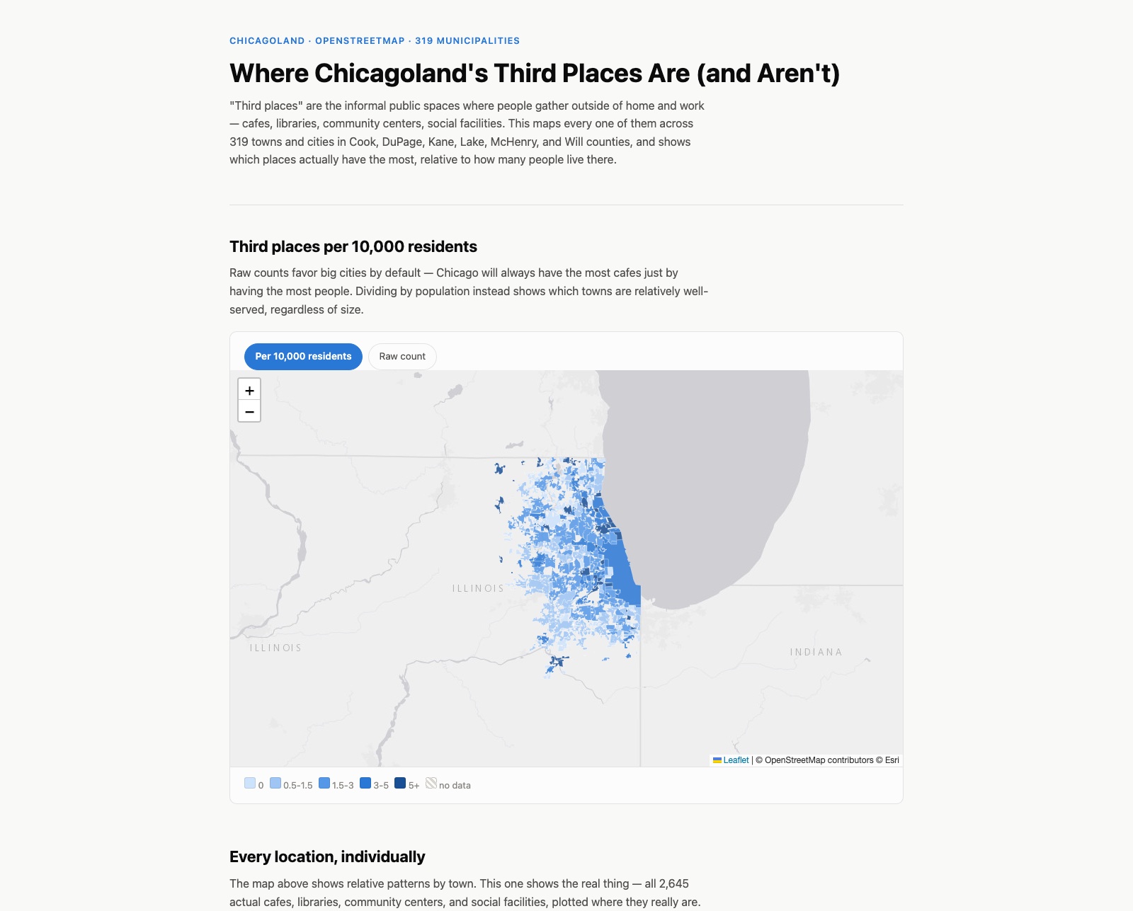
Screenshot of the Chicagoland Third Places map, showing a choropleth of third places per 10,000 residents across Cook, DuPage, Kane, Lake, McHenry, and Will counties.
Civic — Independent Study

Chicagoland Third Places

Every cafe, library, community center, and social facility across 319 Chicagoland municipalities, mapped per capita with a ZIP code search and all 2,645 individual locations plotted.

319 municipalities, 2,645 real locations

Read the story
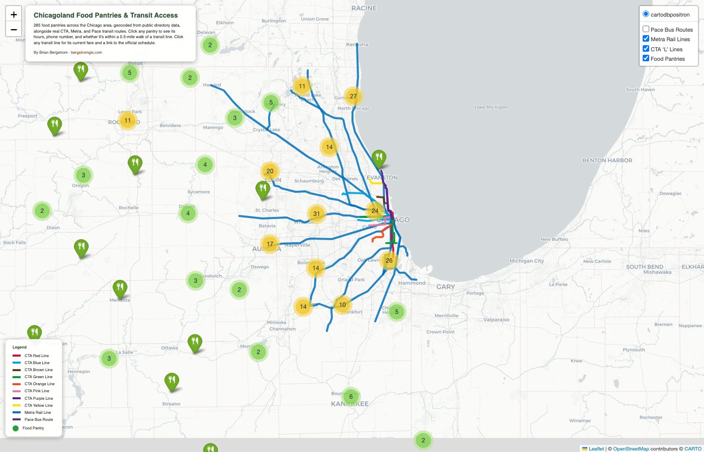
Screenshot of the Chicagoland Food Pantries and Transit Access map, showing CTA, Metra, and Pace transit lines alongside clustered food pantry markers across the Chicago metro area.
Civic — Independent Study

Chicagoland Food Pantries & Transit Access

285 geocoded food pantries across a 90-mile Chicago radius, cross-referenced against real CTA, Metra, and Pace transit lines to show what's actually reachable without a car.

180 of 285 pantries within 0.5 mi of transit

Read the story
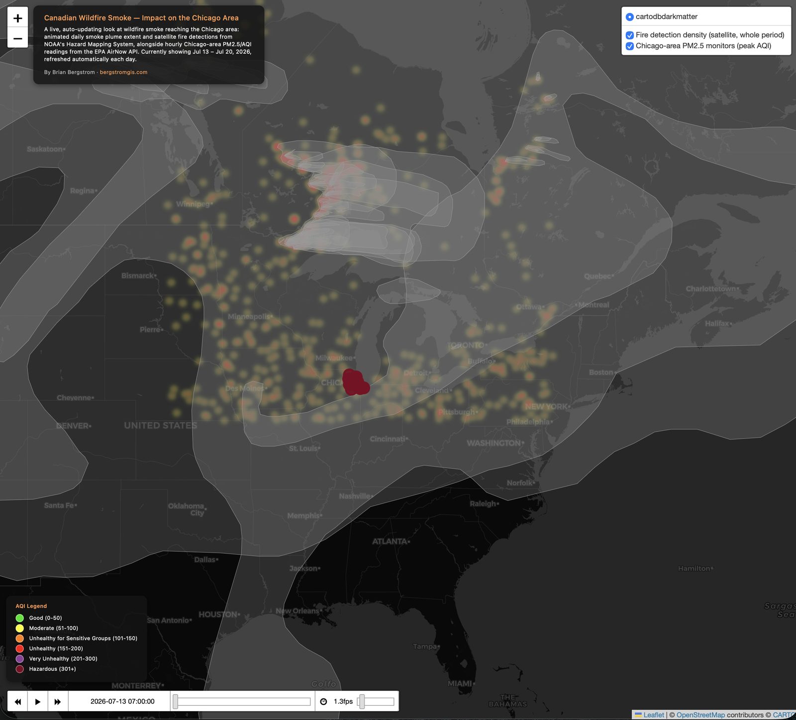
Screenshot of the Canadian Wildfire Smoke Dashboard, showing an animated smoke plume extending from Canada across the Midwest to Chicago, satellite fire detection density near the Canada-US border, and Chicago-area PM2.5 monitors color-coded by AQI severity.
Civic — Independent Study

Canadian Wildfire Smoke Dashboard

Live, auto-updating dashboard tracking Canadian wildfire smoke and its impact on Chicago-area air quality — rebuilds itself daily via GitHub Actions, no manual updates.

Rebuilds automatically every day

Read the story
Title screen of the NAMI DuPage StoryMap: 'Stories from Individuals and Families Living with Mental Health Conditions,' created by Brian Bergstrom.
Civic — NAMI DuPage, 2023

You Are Not Alone

31 in-person community interviews turned into a StoryMap mapping mental health resources across DuPage County. Still live today.

31 responses · 2 weeks

Read the story
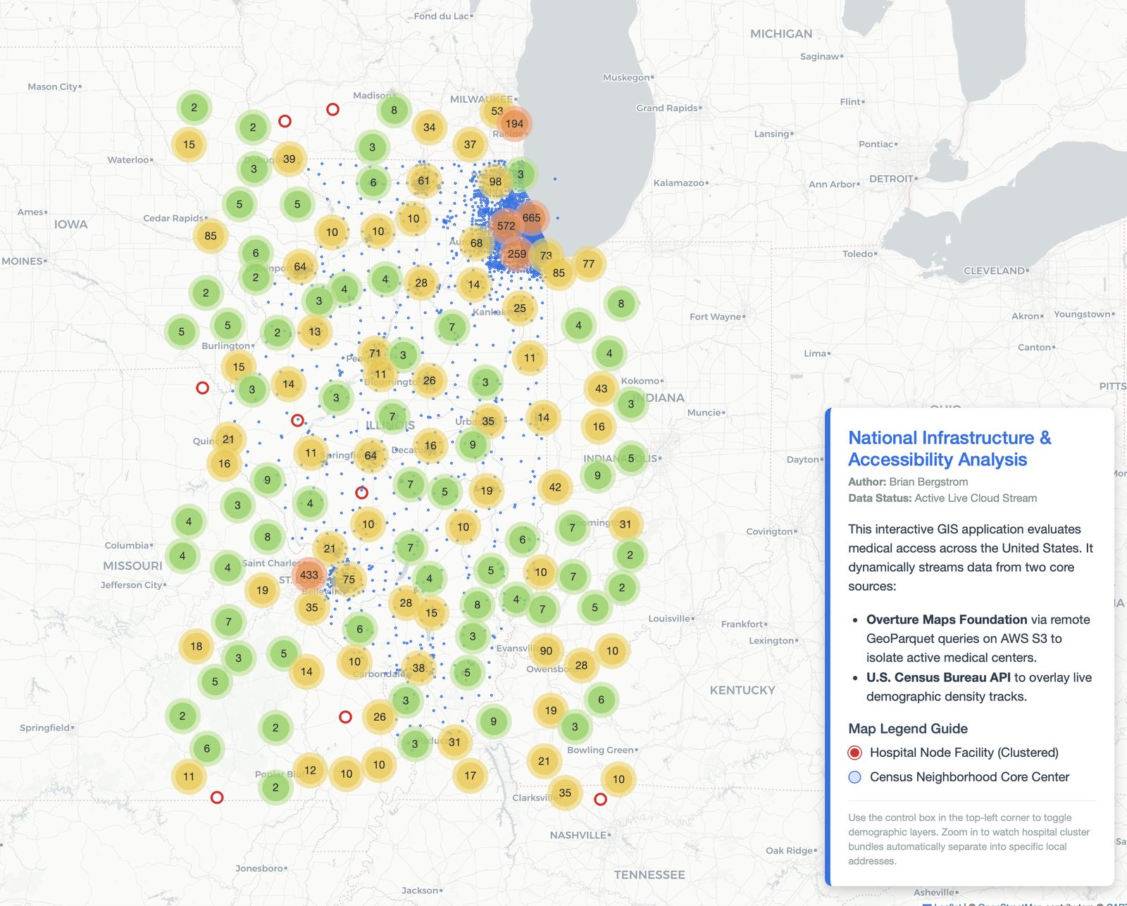
Screenshot of the Hospital Accessibility Analysis dashboard showing clustered hospital counts across Illinois and neighboring states.
Civic — Independent Study

Hospital Accessibility Analysis

Streams live Overture Maps GeoParquet data from AWS S3 alongside Census tract boundary data via pygris to analyze healthcare access across Illinois.

Sparked technical discussion with GIS and software engineers on LinkedIn

Read the story
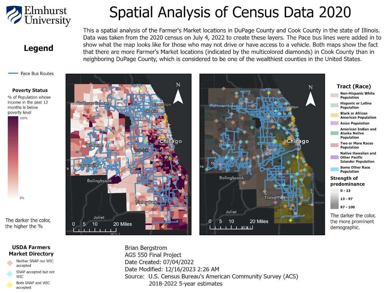
Map comparing food-desert access across DuPage and Cook counties, overlaying SNAP retailers, farmer's markets, and Pace bus routes on 2020 Census demographic data.
Civic — MS-GIS Capstone, 2023 → present

Food Insecurity in DuPage County

My 2023 capstone layering Census data against SNAP retailers and Pace bus routes. Now being rebuilt open-source at a 90-mile Chicago radius — still in progress.

166 / 523 locations (31%) bus-accessible

Read the story
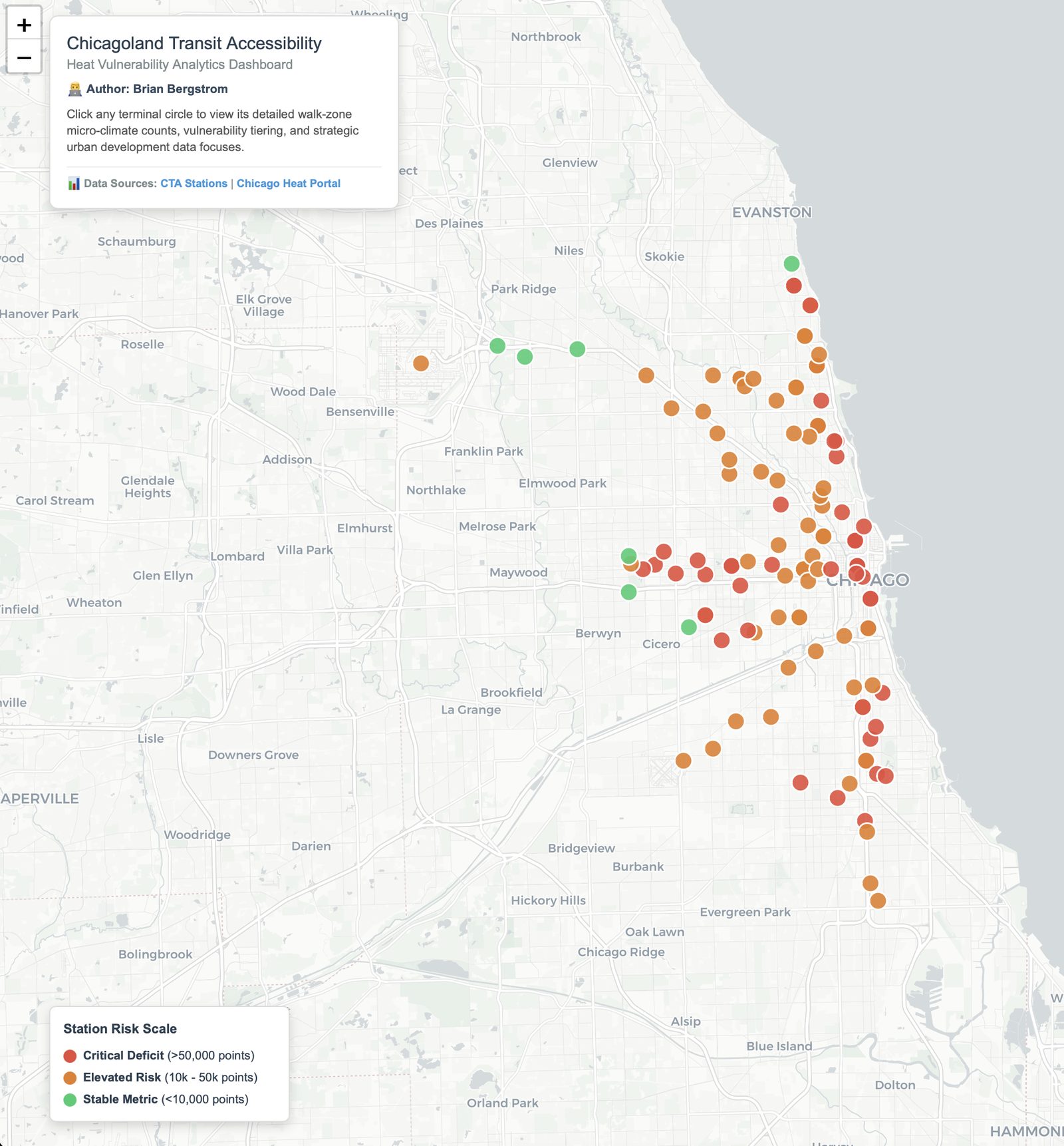
Screenshot of the Chicagoland Transit Accessibility dashboard, showing CTA stations color-coded by heat vulnerability risk.
Civic — Independent Study

Chicagoland Transit Heat Vulnerability

Rates CTA stations across walkable zones by heat vulnerability, layering climate and demographic data to flag where extreme heat hits transit riders hardest.

Read the story
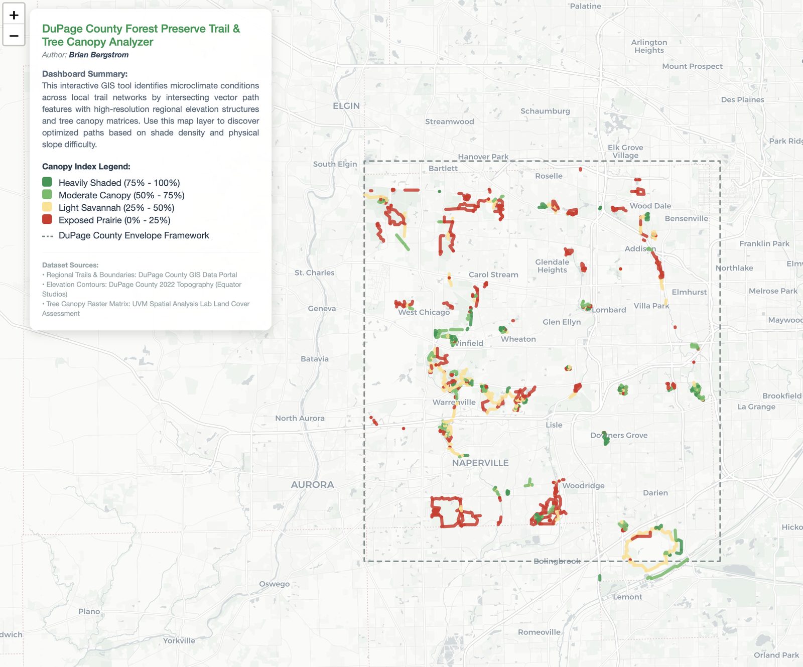
Screenshot of the DuPage County Forest Preserve Trail and Tree Canopy Analyzer, showing trail segments color-coded by canopy shade density.
Civic — Independent Study

DuPage Forest Preserve Trail & Tree Canopy Analyzer

Analyzes canopy cover and trail elevation across DuPage County Forest Preserves to find the shadiest walking routes — built to solve my own need for a cool trail.

Read the story
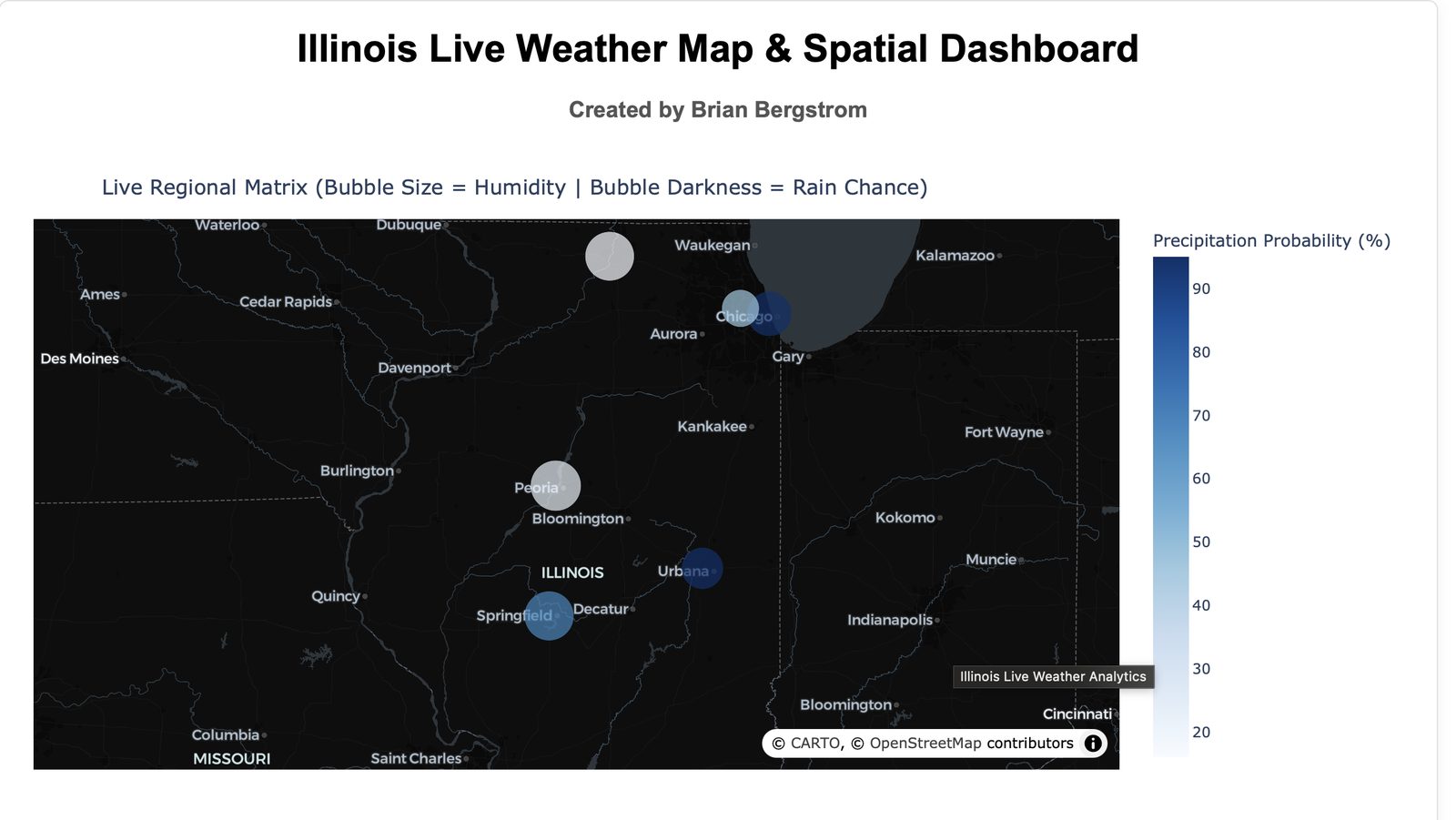
Screenshot of the Illinois Live Weather Map and Spatial Dashboard, showing humidity and precipitation probability bubbles over Illinois cities.
Civic — Independent Study

Illinois Weather Dashboard

Live precipitation and humidity across Illinois weather stations — built after I noticed an unusually long stormy stretch and wanted to see it mapped out.

Read the story
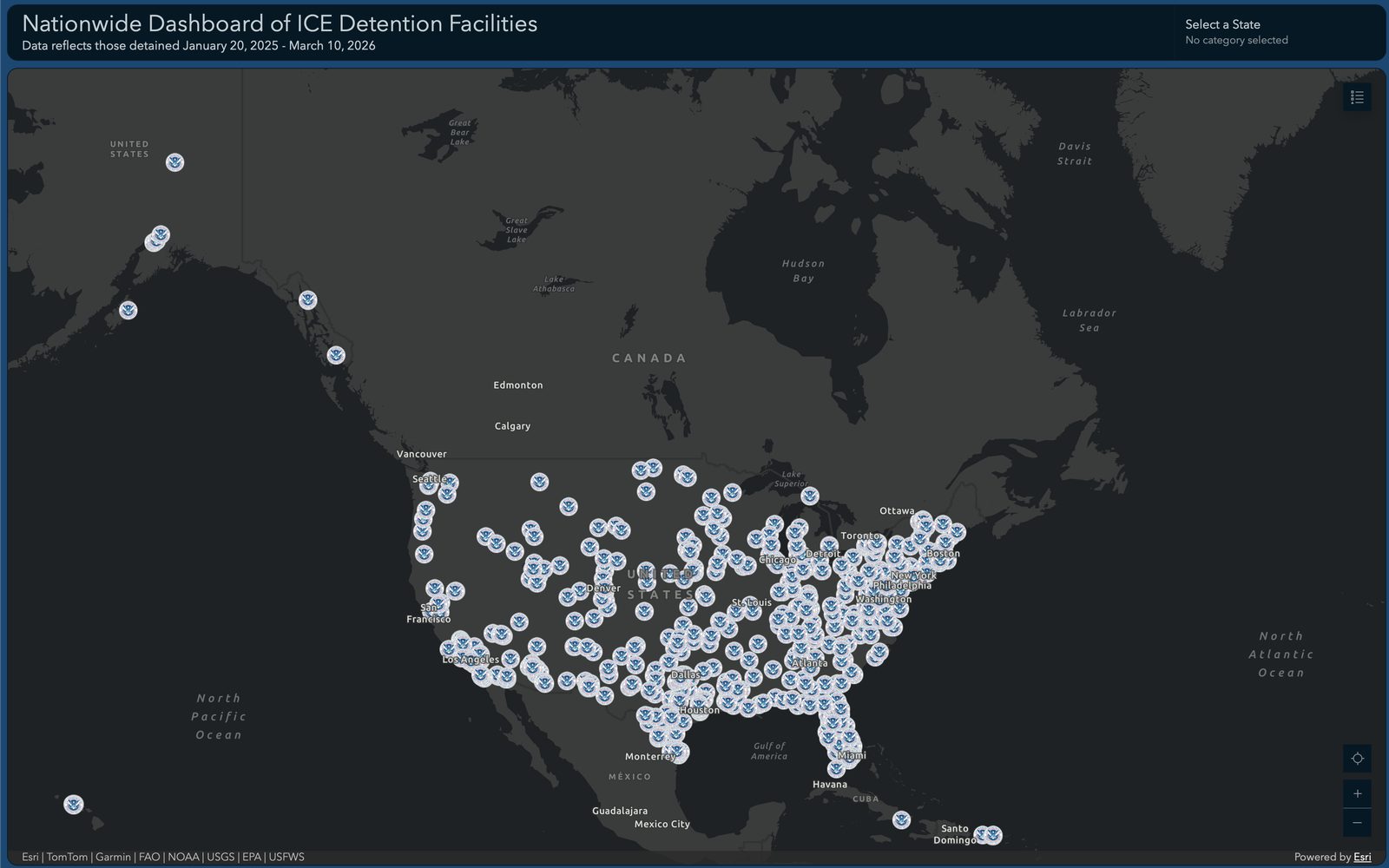
Screenshot of the Nationwide Dashboard of ICE Detention Facilities, showing facility locations plotted across the United States and Canada.
Civic — Independent Study

ICE Detention Facility Map

Maps every U.S. Immigration and Customs Enforcement detention facility and its reported population as of March 2026, built on an ArcGIS Dashboard — making a large, dispersed federal system visible in one place.

Read the story