GIS that makes the overlooked undeniable.
Real maps, real data, real people who needed someone to notice. New ones posted here roughly every week.
Mapping the Response: The Rasuwa Flood
The real volunteer mapping response to the August 2026 Nepal flood, alongside cloud-masked before/after satellite imagery and the real, still-rising toll it responded to.
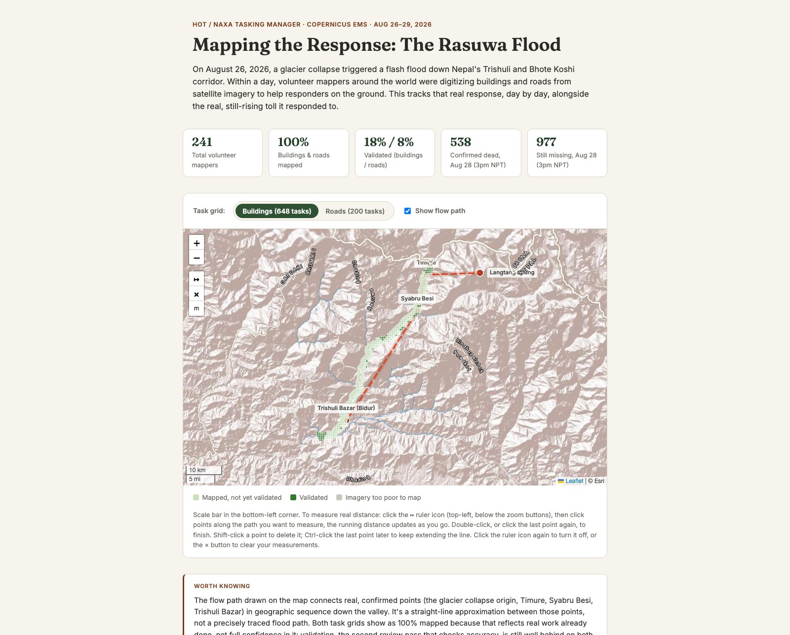
On August 26, 2026, a glacier collapse triggered a flash flood down Nepal's Trishuli and Bhote Koshi corridor. Within a day, the Humanitarian OpenStreetMap Team and NAXA had a Tasking Manager campaign live, and volunteers around the world were digitizing buildings and roads from satellite imagery to help responders on the ground. I'd been learning HOT's own mapping infrastructure for weeks by then, so when this happened I wanted to see it working for real, not build another retrospective analysis once the dust settled.
The actual task grid, not a mockup of one
The map pulls the real task grids for both live Tasking Manager projects straight from HOT's production API: 648 building tasks, 200 road tasks, each colored by its real current status. Both projects reached 100% mapped within about two days, but validation, the second review pass that checks the work for accuracy, was still well behind on both. Showing that gap honestly, not just the "100% done" headline, is the actual point of the map.
Cloud-masked before and after, for real
I wanted a real before/after satellite comparison, not a single cloudy snapshot from whatever day a satellite happened to pass over. The imagery is composited from real Sentinel-2 passes, masked pixel by pixel against actual cloud cover data, so each side shows the clearest real observation available in its time window rather than one lucky (or unlucky) day. It's a real Leaflet map underneath, so you can zoom into a specific village or pan along the valley, not just drag a slider over two flat images.
The "after" imagery is genuinely thin in places. The flood had only just happened, so only one or two real satellite passes existed yet to draw from, and wherever every available pass was cloudy, that patch stays transparent rather than being guessed at. It fills in as more passes come in over the following weeks. The reported death toll and missing count are shown the same way: each figure is a real, individually dated and sourced snapshot, not a single smoothed number, because it kept climbing daily while this was being built and no two trackers agreed on it exactly.
Zoom the map, measure a real distance, or drag the imagery slider to compare.
View the map (opens in a new tab) View the code (opens in a new tab)