GIS Analyst · Chicago

GIS that makes the overlooked undeniable.

Real maps, real data, real people who needed someone to notice. New ones posted here roughly every week.

Welcome

Why this site exists

This started as a portfolio for GIS Analyst job applications. That's changed. It's now a running record of real mapping projects, posted here as I finish them, roughly every week or two.

Every project uses real data and answers a real question, whether that's where mental health care is hardest to reach in Illinois, how a flood response actually unfolded in Nepal, or how the borders of North America shifted over five centuries. Civic projects tend to be about people who get overlooked. Personal ones are just things I find genuinely interesting.

New posts show up here first, with the full archive on the Blog page.

Latest

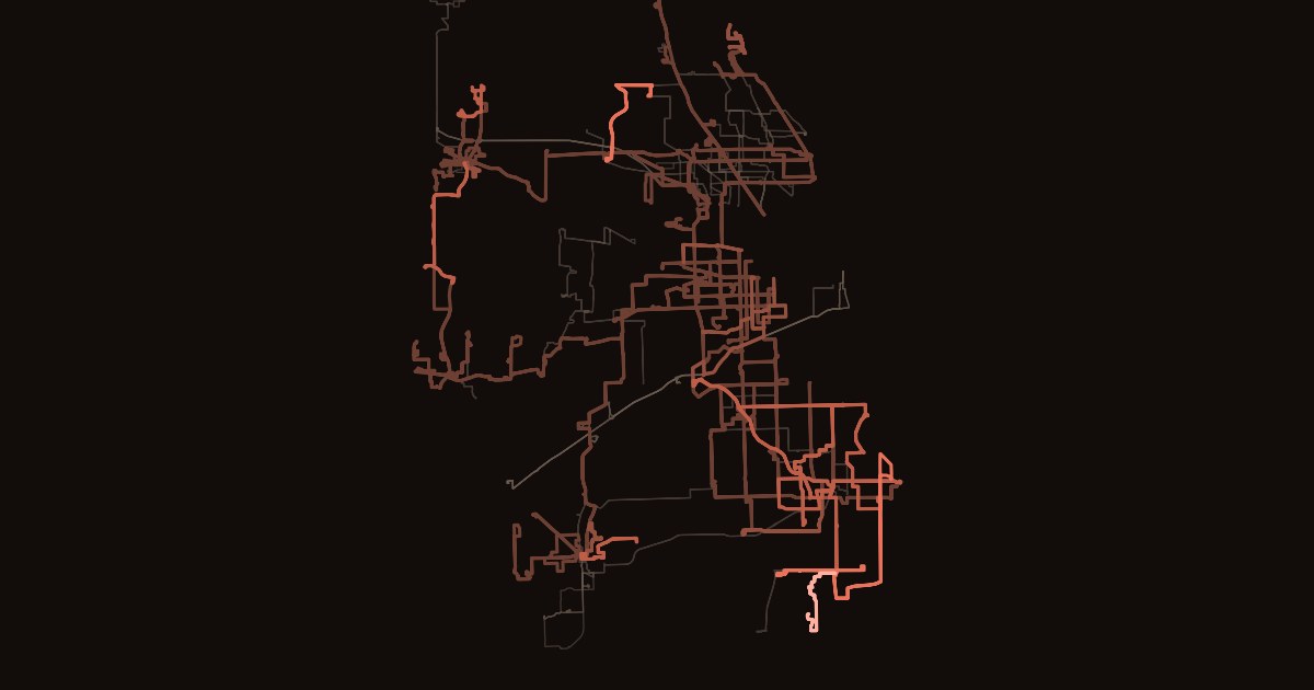
Map of Pace suburban bus routes on a near-black background, each line colored from dim brown to bright coral by the share of its scheduled trips that never appeared on Pace's bus tracker.
Civic — Independent Study

The 309 Doesn't Always Leave Elmhurst

I tracked every Pace bus for a month and checked it against Pace's own schedule. Between 1 in 94 and 1 in 53 trips never appeared, most of them in the south suburbs. At my own stop, a quarter to a third of rush-hour buses never left.

Read the story
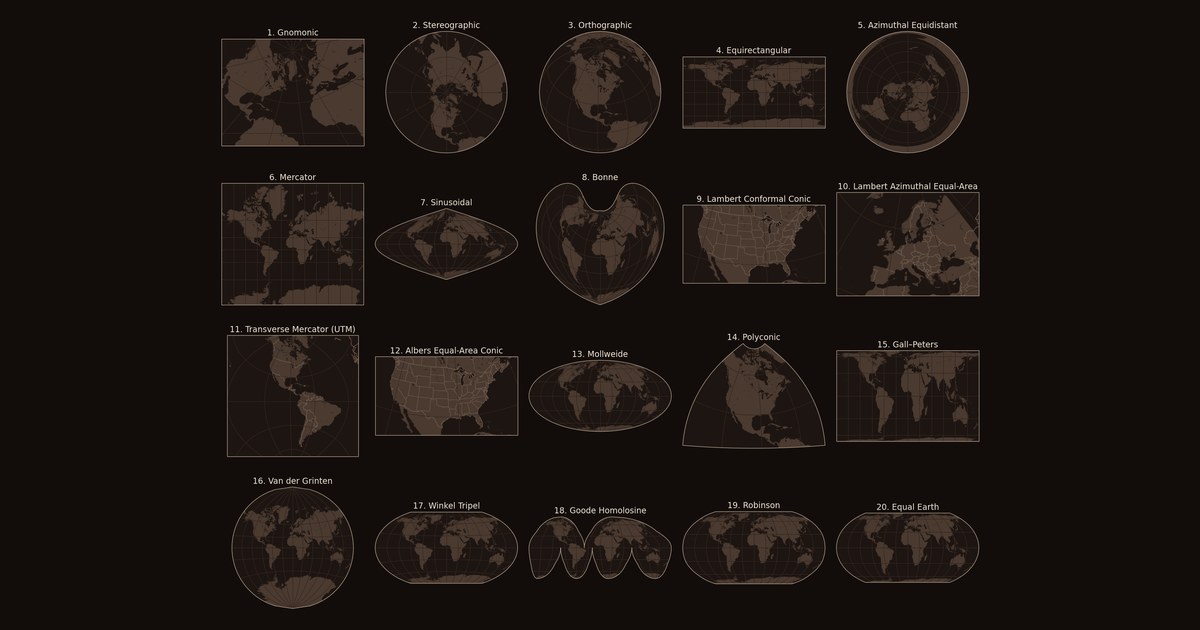
Twenty small world maps in a grid on a near-black background, each drawn in a different map projection, from Gnomonic to Equal Earth.
Personal — Explainer

Every Map Is Wrong

Every flat map of the world distorts something. Twenty map projections, drawn and measured in Python, from ancient star charts to the equal-area map the UN voted for in September 2026, with the story of who made each one and what problem they were trying to solve.

Read the story
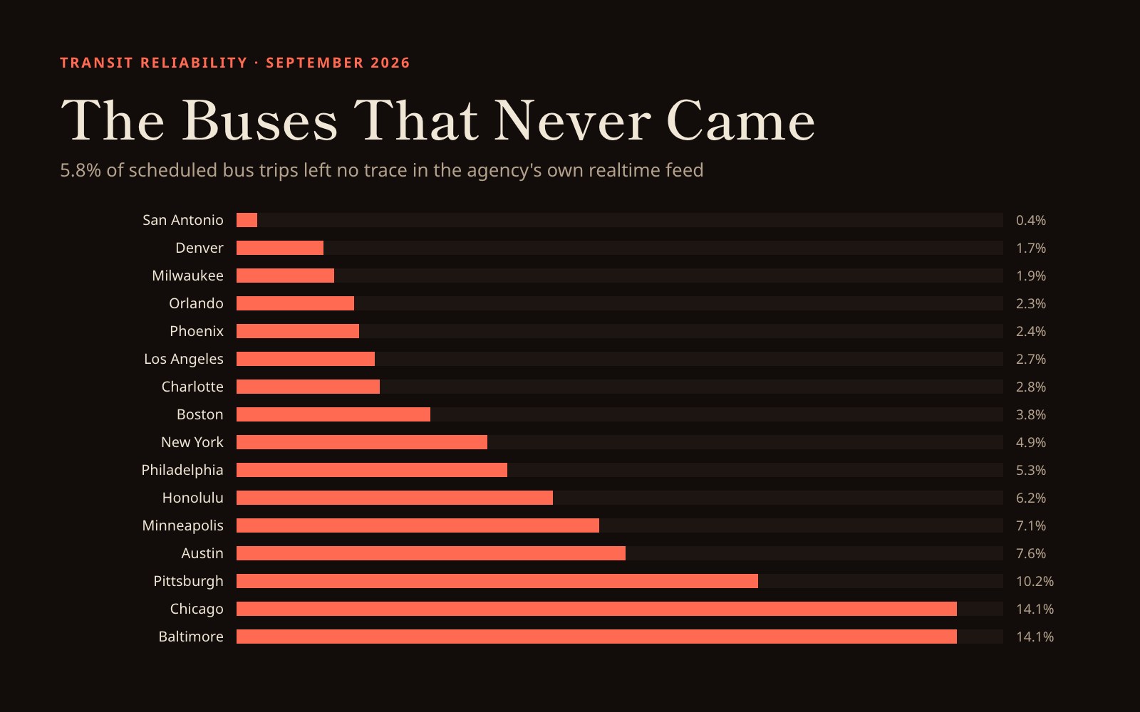
Ranked bar chart in coral on near-black, showing ghost bus rates for sixteen US transit systems from San Antonio at 0.4 percent to Chicago and Baltimore at 14.1 percent.
Civic — Independent Study

The Buses That Never Came

Across sixteen US transit systems, 5.8% of scheduled bus trips left no trace in the agency's own realtime feed. San Antonio missed 0.4%; Chicago and Baltimore missed roughly one trip in seven. Four validity tests stand between the raw feeds and those numbers, and each one exists because it caught a confident, wrong answer first.

Read the analysis
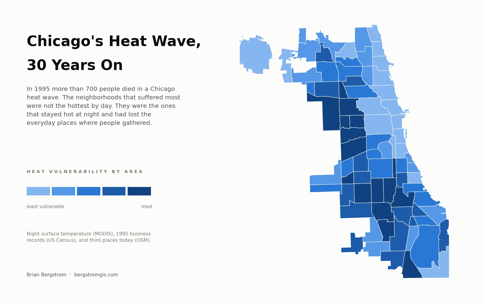
Map of Chicago's 77 community areas shaded by a combined heat vulnerability score, with the darkest areas forming a band across the West and South sides.
Civic — Podcast Episode 3

The Overlap

More than 700 people died in a Chicago heat wave, and the neighbourhoods where they died are not the hottest places in the city. Episode three joins satellite thermal imagery with 1995 business records and today's map of places to gather, and finds that neither map on its own predicts where the deaths clustered.

Listen to episode three
Equal Earth projection world map in deep red on cream, with the title Dulcet GIS and the line Spatial thoughts on our crazy world below it.
Civic — Podcast Episode 2

The Empty Square

Is that blank space on the map empty because nothing is there, or because nobody looked? A map draws those two exactly the same. Episode two teaches four lessons in reading maps, tested against 14,510 humanitarian mapping projects and every UN humanitarian appeal since 2014.

Listen to episode two
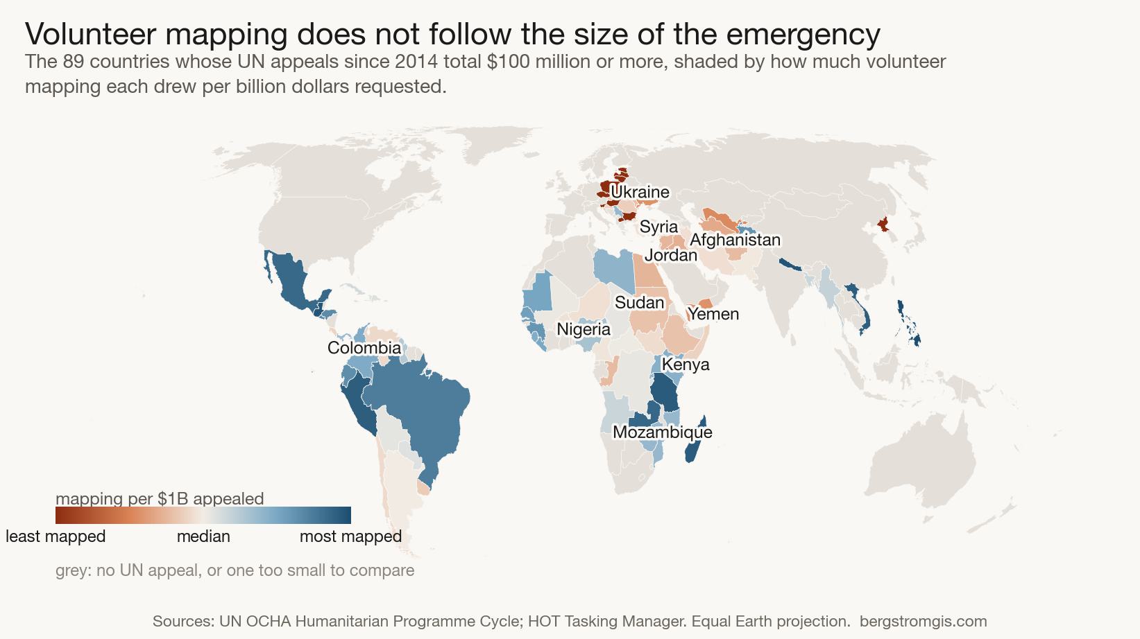
World map on the Equal Earth projection showing countries with UN humanitarian appeals shaded by how much volunteer mapping they drew per billion dollars requested. Ukraine, eastern Europe, Syria, Jordan, Afghanistan and Yemen are the least mapped.
Humanitarian — Independent Study

Where Humanitarian Mapping Happens

Joining 14,510 volunteer mapping projects against every UN humanitarian appeal since 2014 shows that volunteer mapping tracks the size of an emergency only up to a point. Among the 36 largest crises, the relationship disappears.

Read the story

See all posts →