GIS Analyst · Chicago

GIS that makes the overlooked undeniable.

Real maps, real data, real people who needed someone to notice. New ones posted here roughly every week.

Personal work

Not everything I build is trying to fix something. Some of it is just for fun, or for a friend — genuine technical care applied to whatever I'm into, not a client ask.

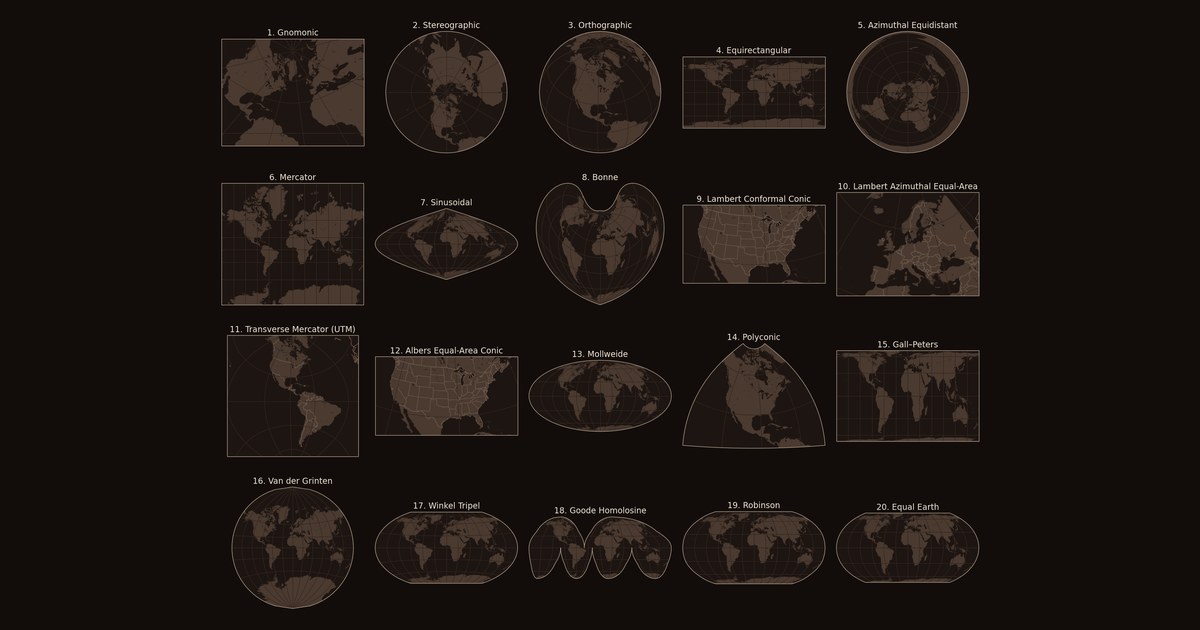
Twenty small world maps in a grid on a near-black background, each drawn in a different map projection, from Gnomonic to Equal Earth.
Personal — Explainer

Every Map Is Wrong

Every flat map of the world distorts something. Twenty map projections, drawn and measured in Python, from ancient star charts to the equal-area map the UN voted for in September 2026, with the story of who made each one and what problem they were trying to solve.

Read the story
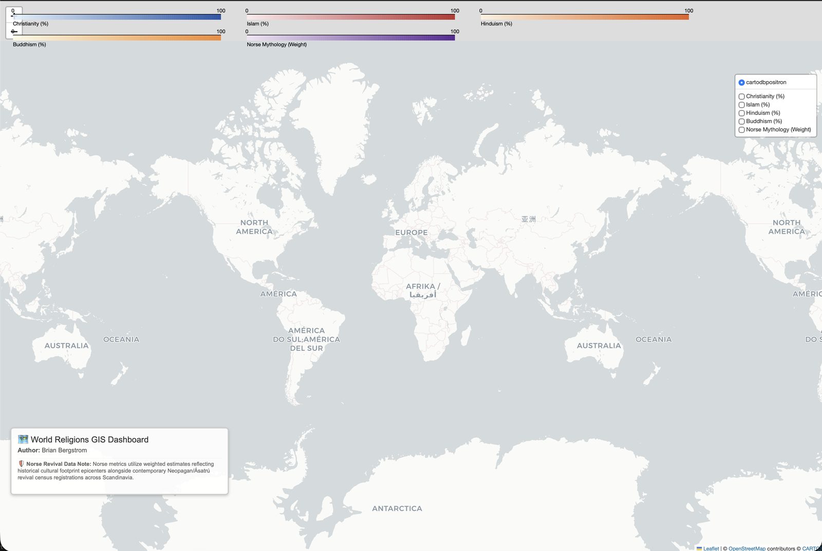
Interactive dark-themed world map showing dominant religion by country, with real OpenStreetMap Pagan and Heathen sites marked and Iceland's real Ásatrú membership growth.
Personal — gift

World Religions, Mapped for Real

A full rebuild of an early AI-assisted project running on fake mock data, replaced with real Pew Research figures, real OpenStreetMap Heathen sites, and Iceland's real government-tracked Ásatrú growth.

Originally built as a gift, for a friend who practices that faith.

Read the story
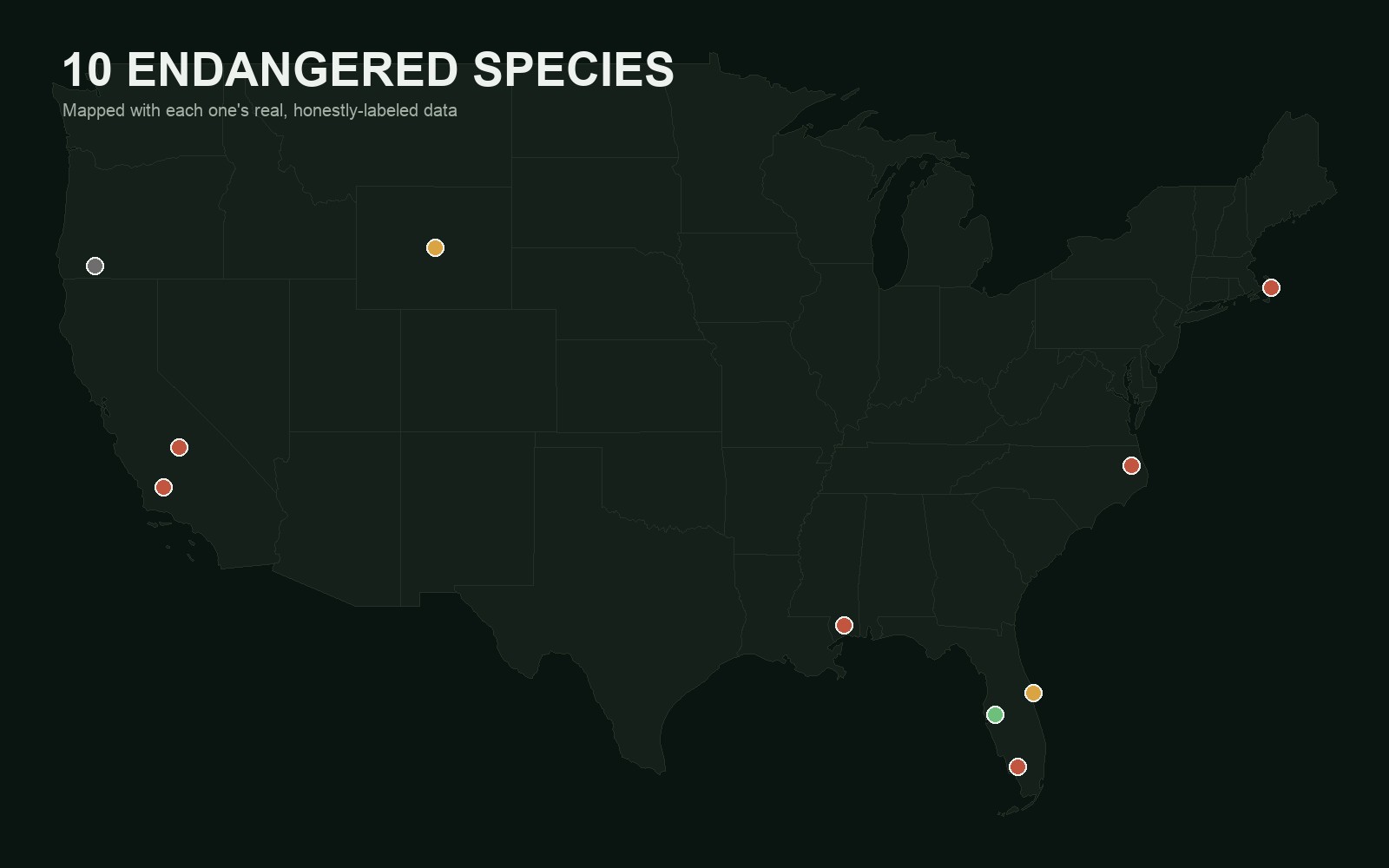
Dark map of the continental United States with ten colored markers showing the real locations of ten endangered species.
Personal — pure interest

10 Endangered Species, Mapped Honestly

Ten of the most endangered species in the U.S., each mapped with its own real, best-available metric, not one uniform number forced onto all of them.

10 species, 10 different real metrics

Read the story
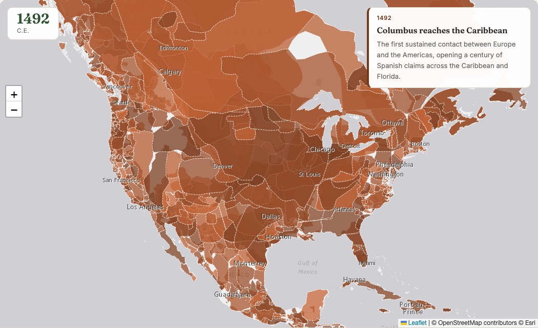
Screenshot of the US Territorial Timelapse map at 1492, showing the entire North American continent as a mosaic of individually named Indigenous nations in warm earth tones.
Personal — pure interest

How the United States Took Shape

A timelapse of who actually controlled North American territory, 1492 to today: Indigenous nations, colonial powers, and the country that eventually absorbed most of it.

22 real snapshots, 25 curated events

Read the story
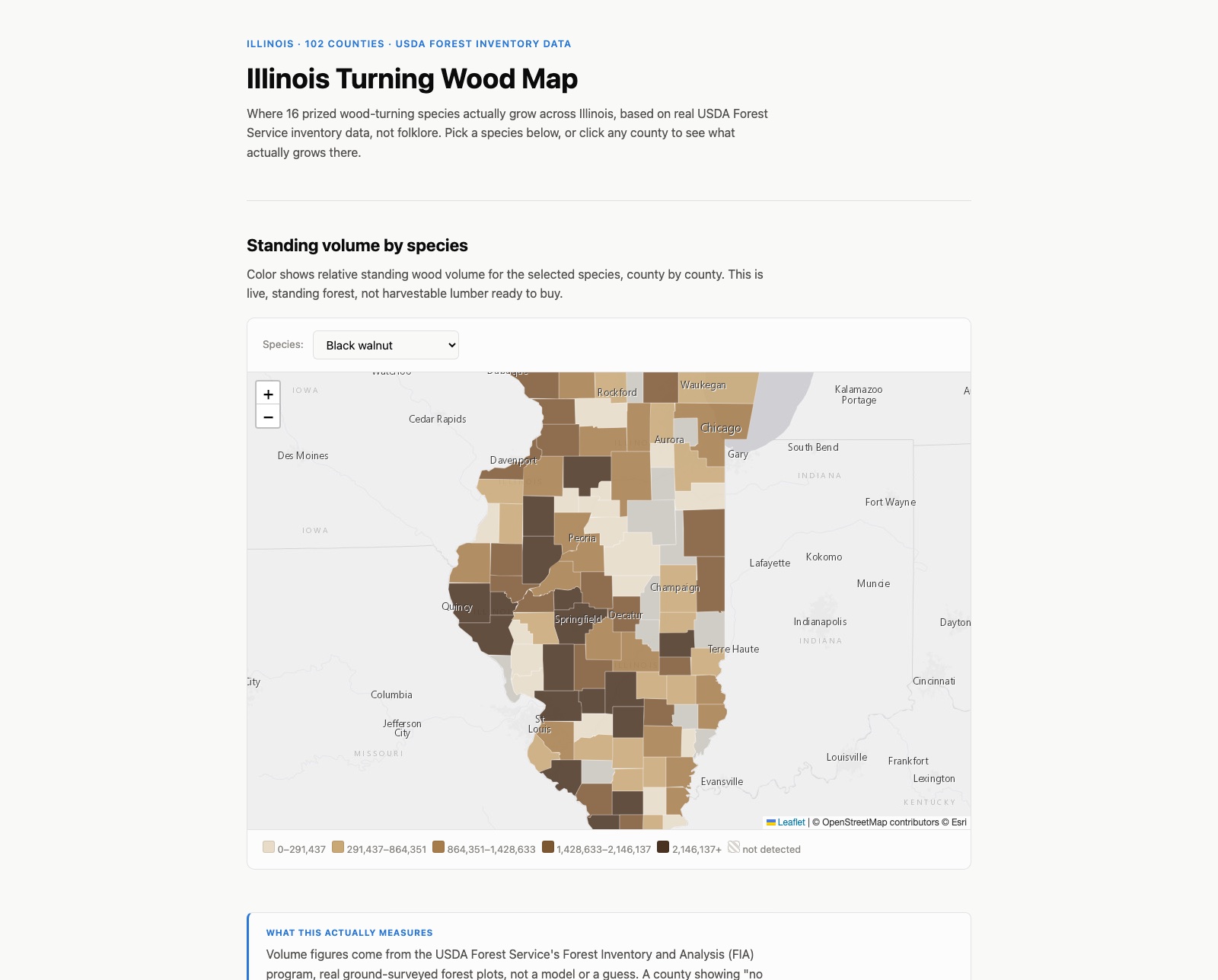
Screenshot of the Illinois Turning Wood Map, showing a choropleth of black walnut standing volume across Illinois counties in shades of brown, with a species selector dropdown.
Personal — gift

Illinois Turning Wood Map

Where 16 prized wood-turning species actually grow across Illinois, based on real USDA Forest Service survey data, with a species selector and per-county rankings.

Built as a surprise for my uncle, a well-known wood turner in the Chicago area.

Read the story
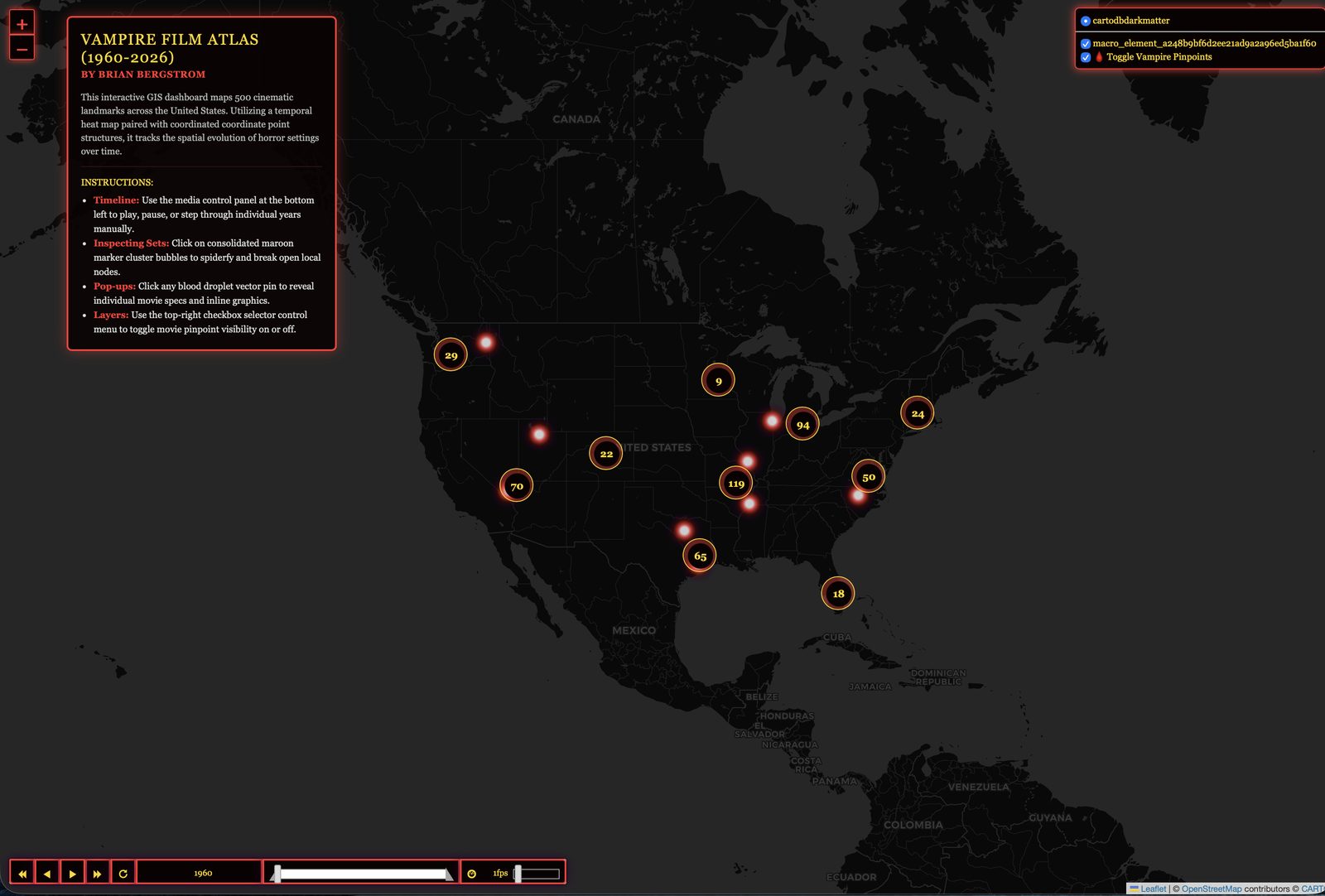
Screenshot of the Vampire Film Atlas (1960-2026) dashboard, showing horror-film location counts across the U.S. and a year timeline scrubber.
Personal — gift

Vampire Film Atlas

A temporal heat map of roughly 500 vampire and horror film filming and setting locations across the U.S., spanning 1960 to 2026.

Built as a gift for a friend who runs the horror-film Discord community I'm part of.

Read the story
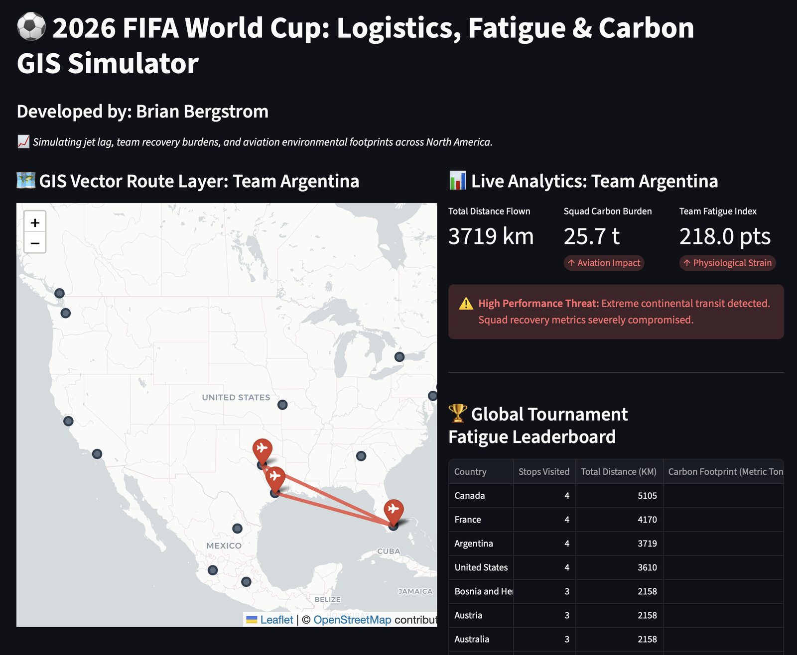
Screenshot of the 2026 FIFA World Cup Logistics, Fatigue and Carbon GIS Simulator, showing Team Argentina's travel route and a fatigue leaderboard by country.
Personal — pure interest

World Cup Fatigue Dashboard

Tracks player and team fatigue across the 2026 World Cup, combining travel distance between matches with days of rest.

Read the story