GIS that makes the overlooked undeniable.
Real maps, real data, real people who needed someone to notice. New ones posted here roughly every week.
World Religions, Mapped for Real
A full rebuild of one of my earliest AI-assisted projects, replacing fake mock data with real Pew Research figures, real OpenStreetMap Pagan and Heathen sites, and Iceland's real government-tracked Ásatrú membership growth.
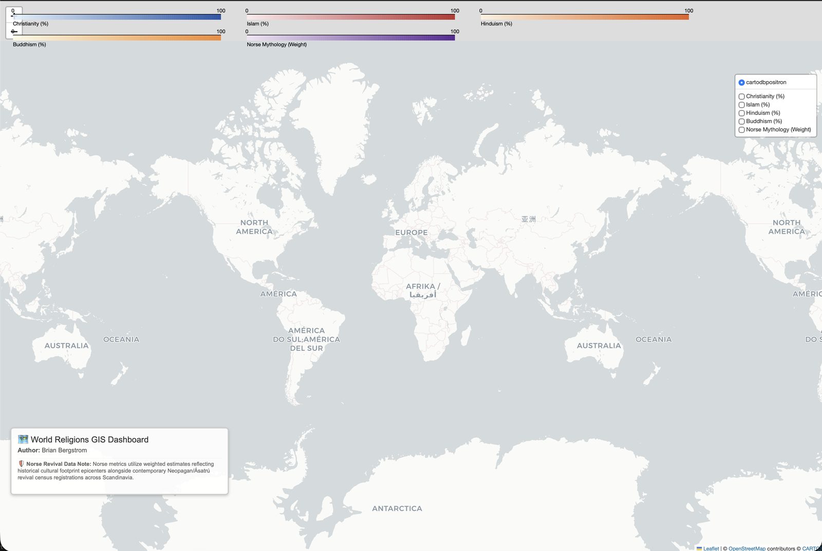
This was originally built as a gift, for a friend who practices Ásatrú, a modern Norse Heathen faith, and it was one of the first things I ever built while testing out AI coding tools. Going back to it now, the map itself was barely readable and, worse, the underlying data was fake. The original notebook's own comments say so directly: a cell literally labeled "Mock Data" gave every major world religion a single hardcoded latitude and longitude, and the country borders were four-point rectangles typed by hand, not real geography. The write-up claimed "particular methodological care" on the Ásatrú data that the code never actually did. I wanted to go back and actually do that work.
What's real now
Every country's religious composition comes from Pew Research Center's Global Religious Landscape estimates (via Our World in Data), for both 2010 and 2020, with a real toggle to compare them. Country geometry is real Natural Earth boundary data, not hand-drawn rectangles. A DuckDB pipeline does the actual joins and aggregation in SQL rather than hand-rolled Python loops.
Iceland's Ásatrúarfélagið was the first modern Heathen organization in the world to receive official state recognition, in 1973. Because Iceland registers religious organizations formally, Statistics Iceland has published its real annual membership count every year since 1998: 280 members that year, 6,158 by 2026, a real, government-tracked 22x increase over 28 years. That's on the map now as an actual time series, not a guess. A second, smaller state-tracked group, the Pagan Chieftainship of Reykjavík, is real too, and has stayed small (18 to 39 members) since it started being tracked separately in 2007.
A dominant-religion map hides more than it shows
Coloring countries by which religion holds a plurality is the obvious way to map this, and it's also mostly useless for showing change over time: only 2 of 168 countries actually flip their dominant religion between 2010 and 2020 in this dataset. But the real underlying shares moved a lot underneath that. Australia's Christian share dropped from 67% to 47%, a real 20-point swing, while staying the largest single category the whole time. Chile dropped 18 points, the U.S. 14. The map has a second view, "Change since 2010," that colors every country by the real point-change in its unaffiliated share instead, since that's the one trend visible almost everywhere in the data, and it's the only way this kind of shift actually shows up on a map.
Where the real data runs out, and I say so
OpenStreetMap has 324 real points worldwide tagged religion=pagan,
including 10 explicitly tagged Ásatrú or Norse, genuine crowd-mapped sacred sites
like Iceland's own Ásheimur Hof. That's real, but it's sparse and uneven, a
reflection of who has mapped what, not a census, and the map says exactly that
rather than implying more coverage than exists. Sikhism, Jainism, Baha'i, and other
smaller world religions aren't broken out as their own category, because Pew's own
published methodology doesn't break them out by country either; they fall under
"Other" in the source data itself, and I chose not to fake a precision Pew doesn't
claim.
Explore the real map, by country and by year.
View the map (opens in a new tab) View the code (opens in a new tab)