Lake Ontario, or Lake America?
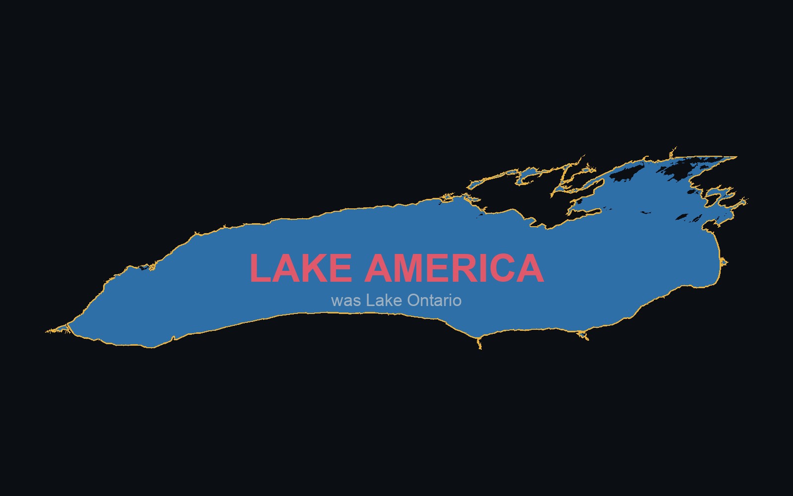
A single executive order renamed a Great Lake for U.S. Google Maps users. A real toggle map showing what changed, and why OpenStreetMap doesn't work that way.
Read the storyGIS that makes the overlooked undeniable.
Real maps, real data, real people who needed someone to notice. New ones posted here roughly every week.
Every project I build, in the order I built it. Some weeks that's a full interactive map, some weeks it's a shorter write-up about a technique or a dead end I ran into. Real data, real sources, real limitations, every time.
Subscribe via RSSA single executive order renamed a Great Lake for U.S. Google Maps users. A real toggle map showing what changed, and why OpenStreetMap doesn't work that way.
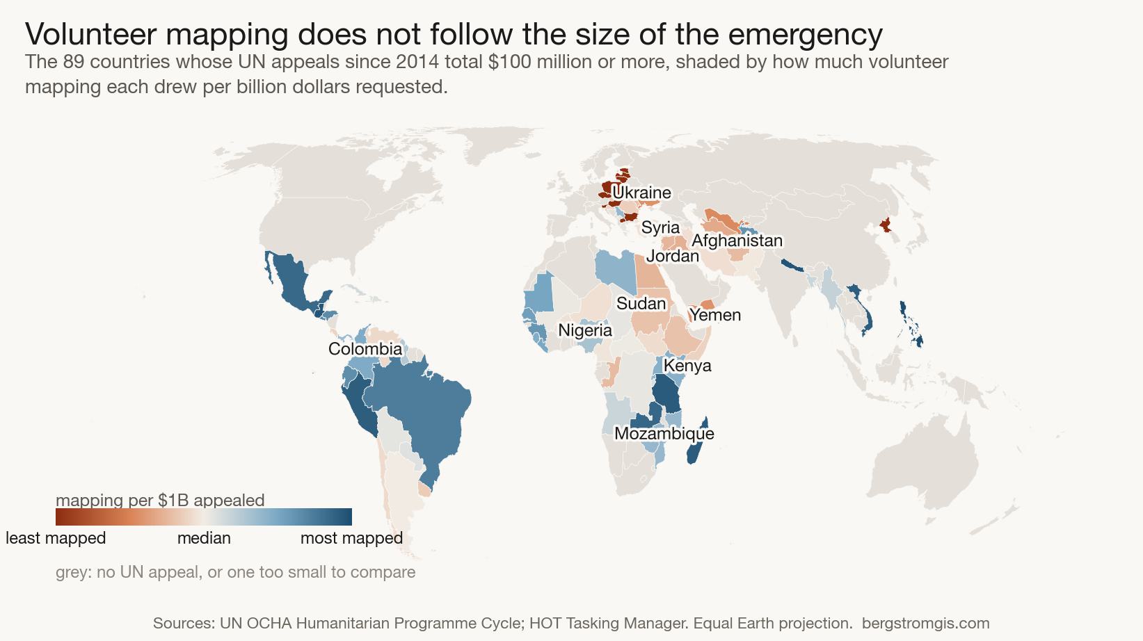
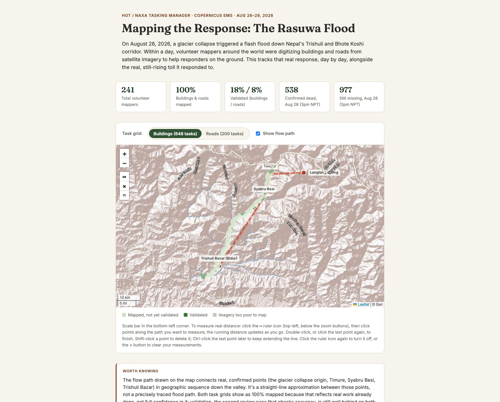
Read the storyThe real HOT/NAXA volunteer mapping response to the August 2026 Rasuwa flood in Nepal, alongside cloud-masked before/after satellite imagery and the real, still-rising toll.
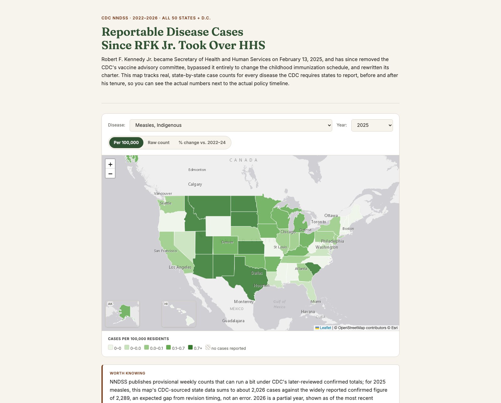
Read the storyA national map of real, state-by-state case counts for every CDC-notifiable disease, tracked against the actual dated timeline of federal vaccine policy changes since RFK Jr. took over HHS.
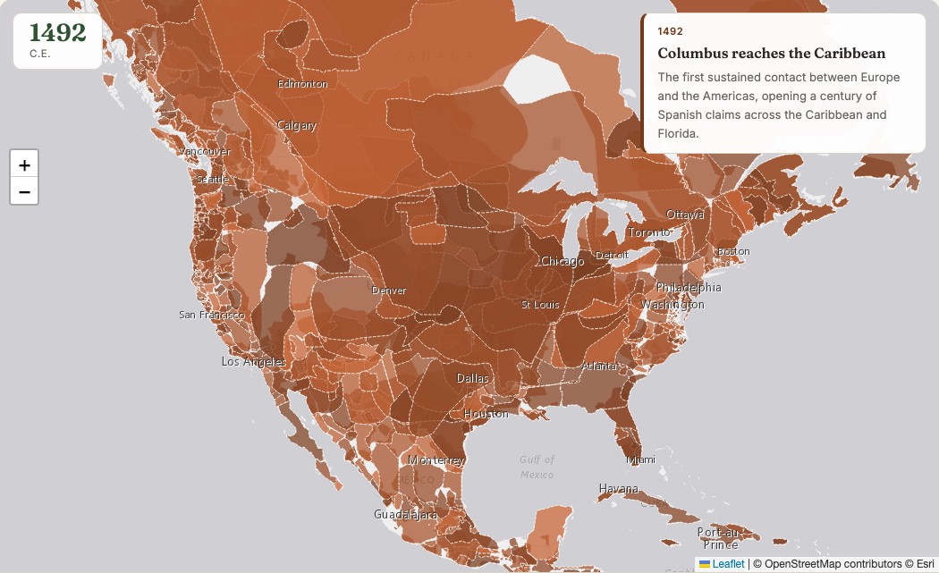
Read the storyA timelapse map of who actually controlled North American territory, 1492 to today: Indigenous nations, colonial powers, and the United States.
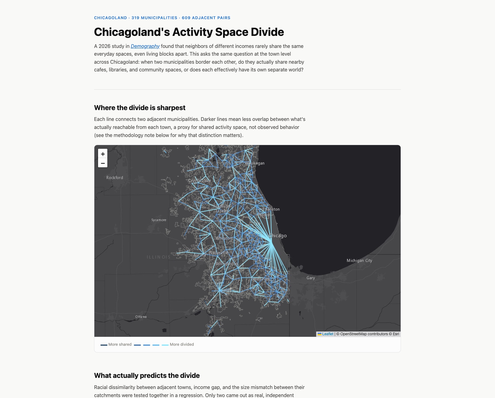
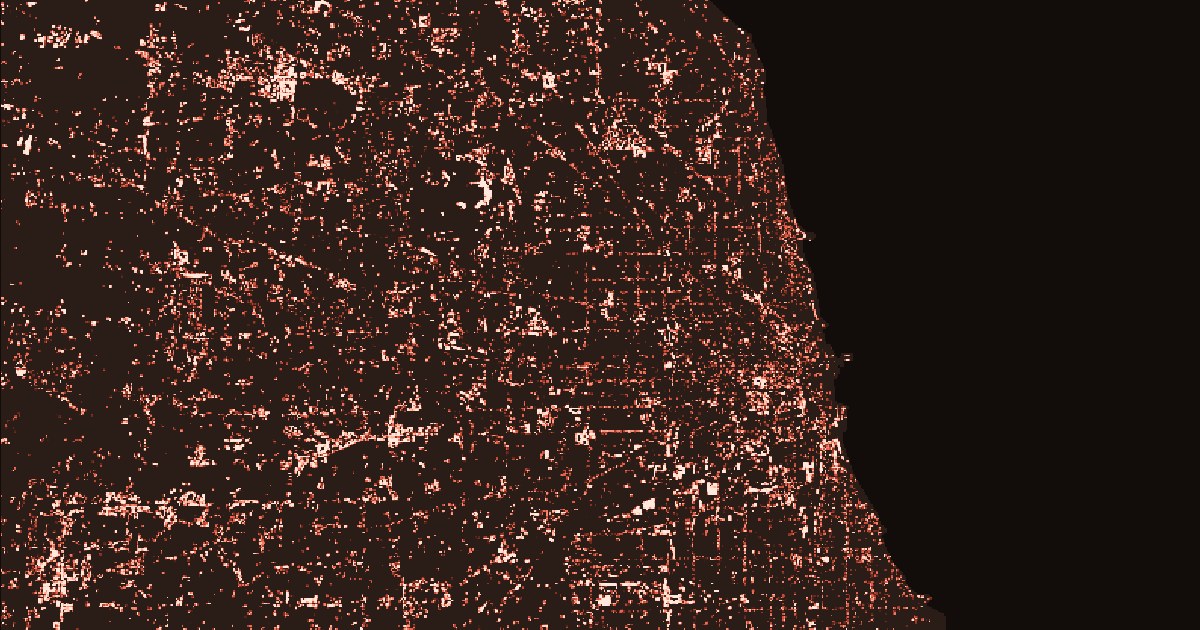
Read the storyTesting a 2026 Demography paper's finding about shared activity space and segregation, at the Chicagoland municipality level.
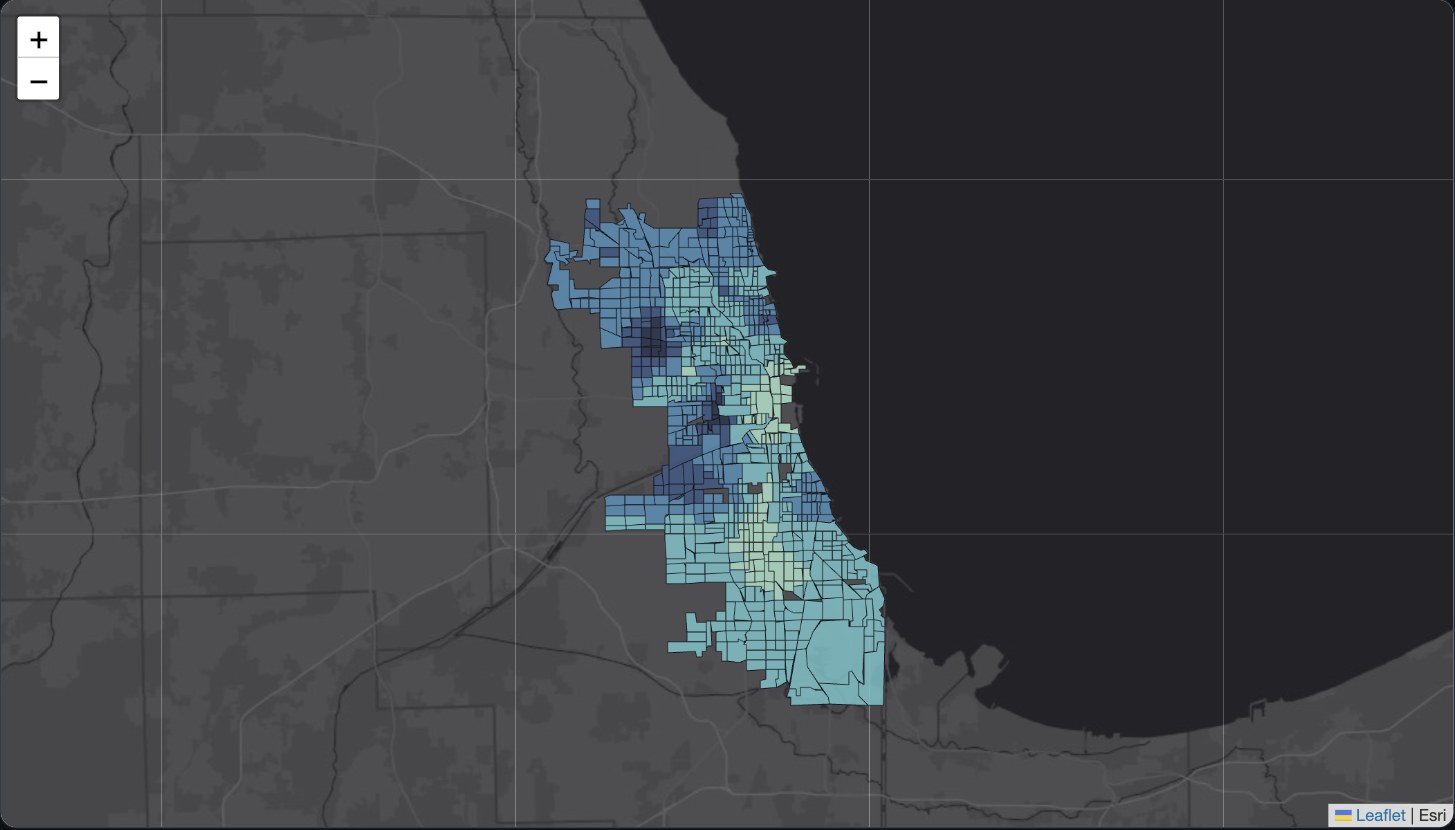
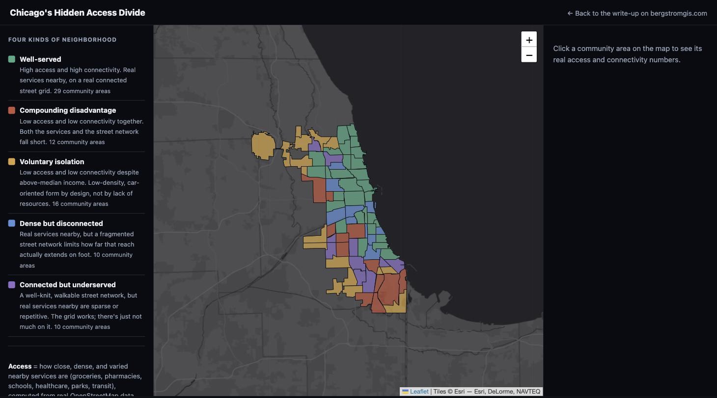
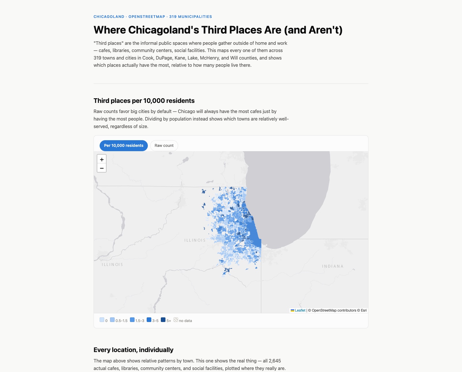
Read the storyEvery cafe, library, community center, and social facility across 319 Chicagoland municipalities, mapped per capita so towns of any size can be compared fairly.
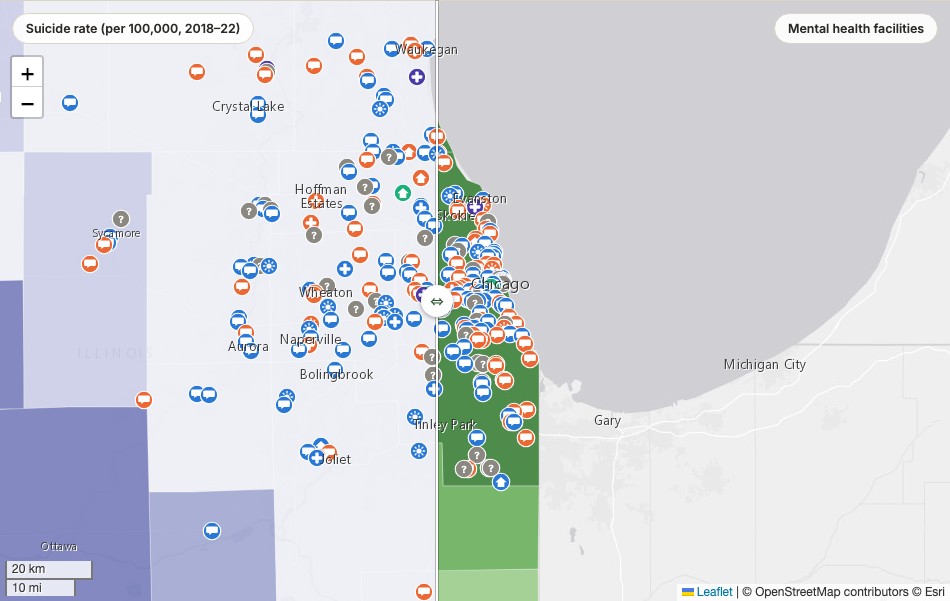
Read the storyCounty-level suicide rates, mental distress, and uninsured rates swiped directly against mental health facility locations across all 102 Illinois counties.
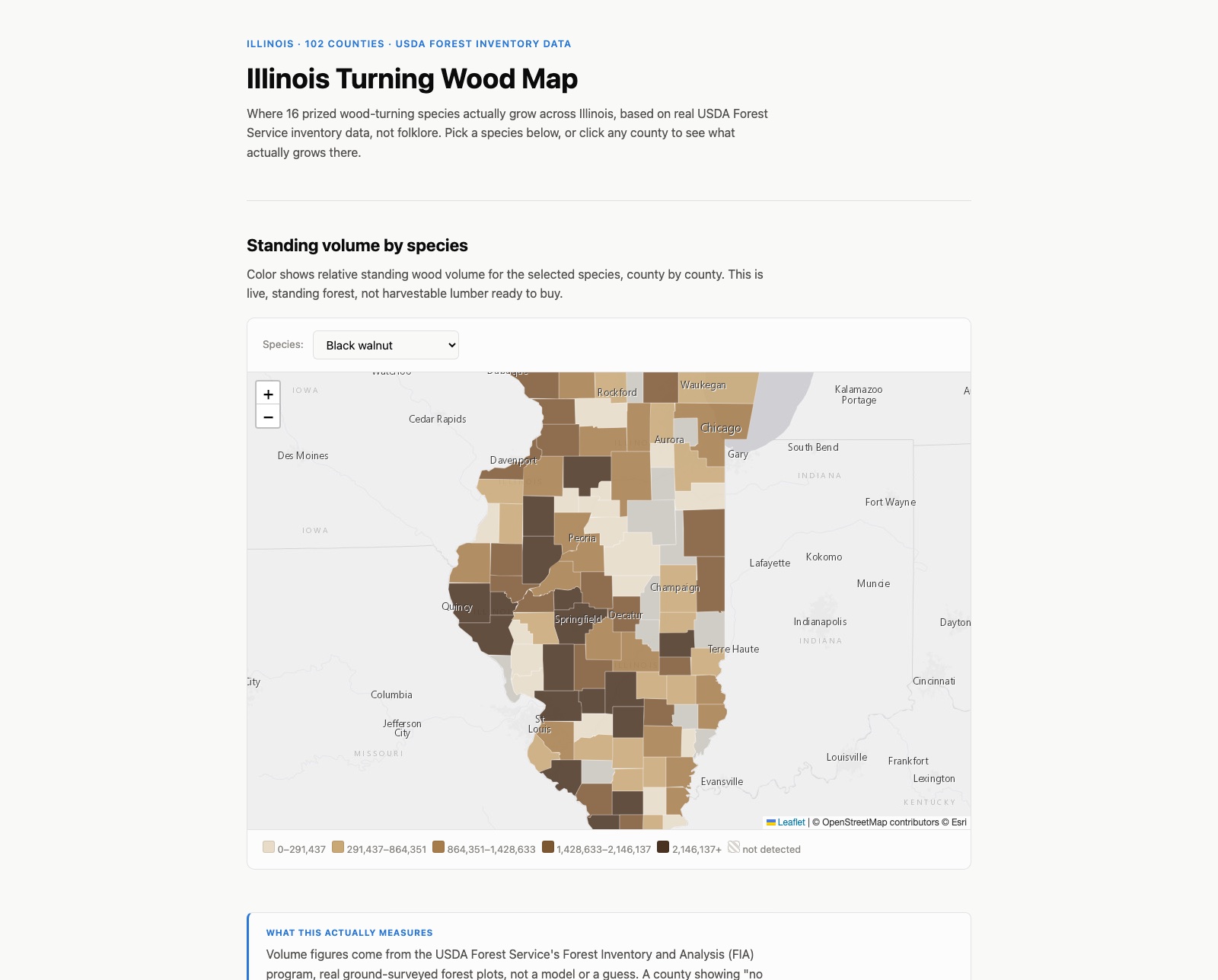
Read the storyWhere 16 prized wood-turning species actually grow across Illinois, based on real USDA Forest Service survey data. Built for my uncle, a wood turner in the Chicago area.
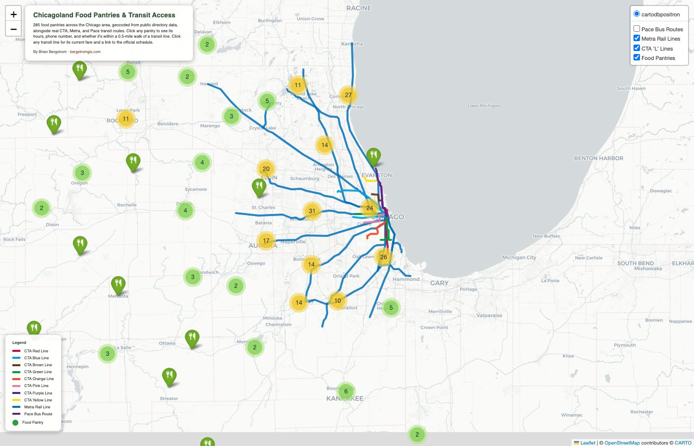
Read the storyAn interactive map of 285+ Chicago-area food pantries cross-referenced against real CTA, Metra, and Pace transit lines.
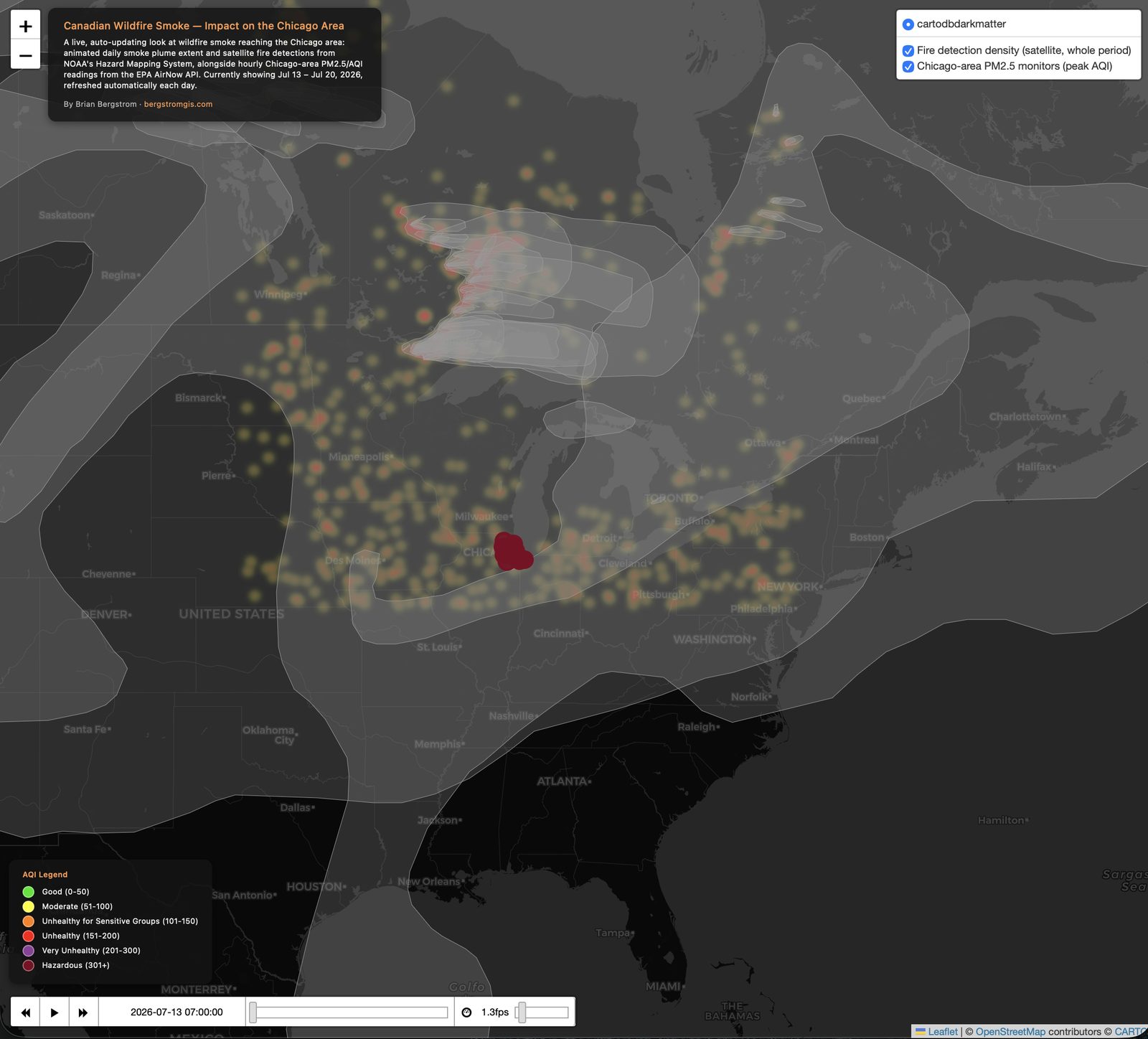
Read the storyA live, auto-updating dashboard tracking Canadian wildfire smoke and its impact on Chicago-area air quality.
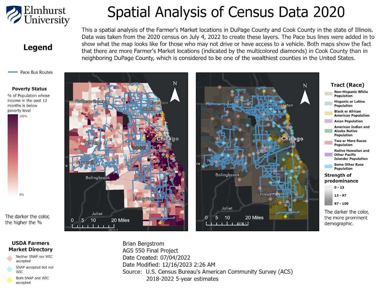
Read the storyA 2023 GIS capstone proving real food insecurity in one of the wealthiest counties in the country, now being rebuilt open-source at a 90-mile Chicago radius.
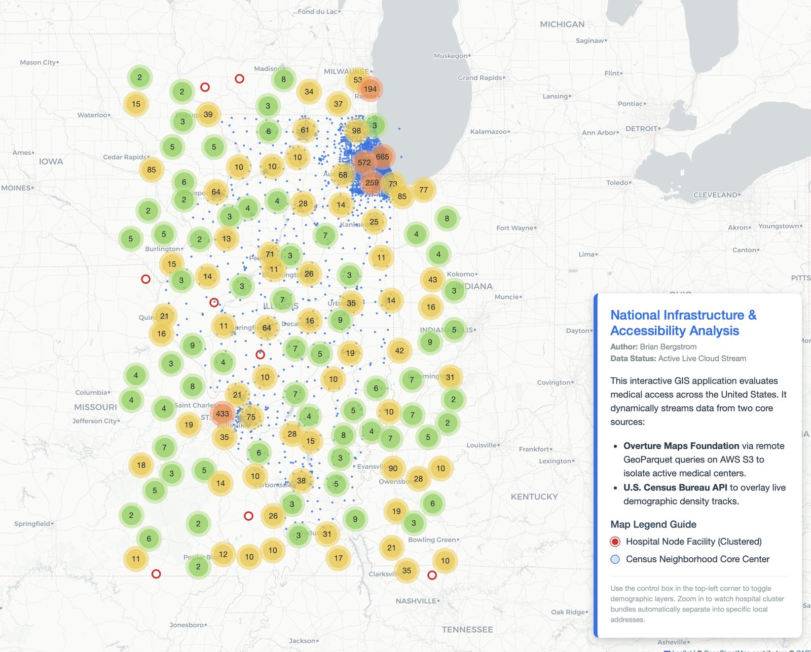
Read the storyA live dashboard analyzing healthcare accessibility across Illinois, streaming cloud-native geospatial data in real time.
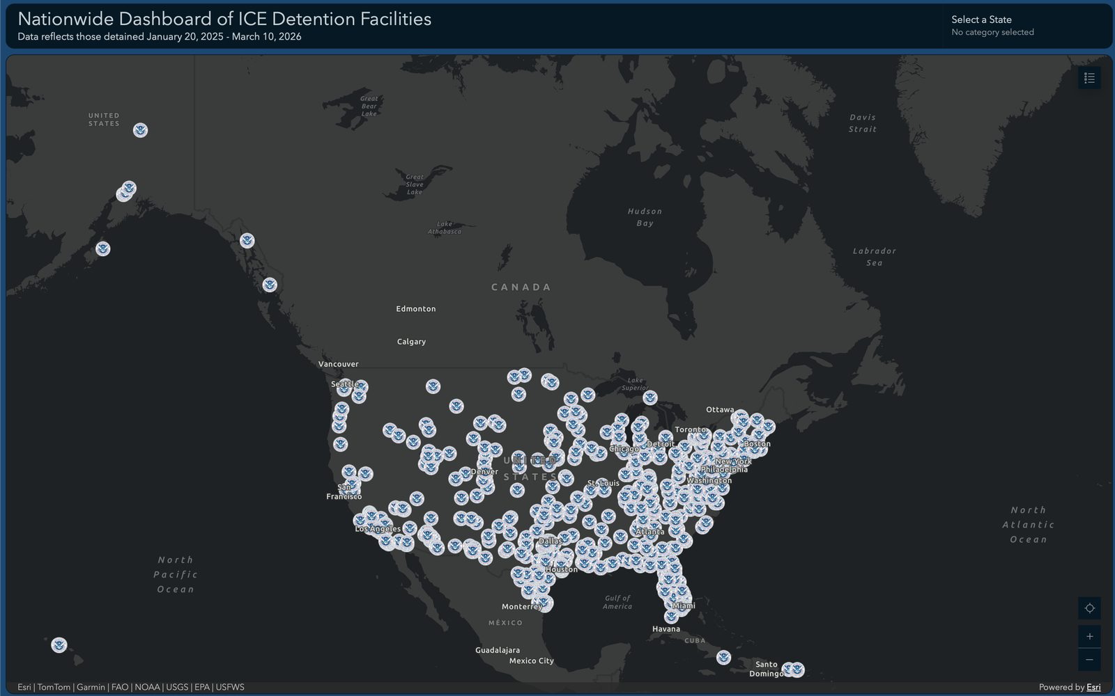
Read the storyA dashboard mapping every U.S. Immigration and Customs Enforcement detention facility and its reported population.
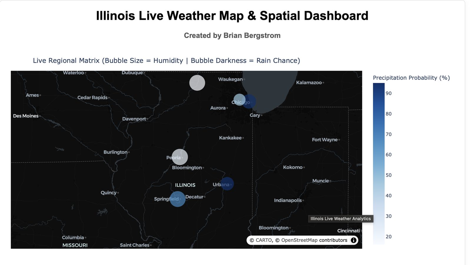
Read the storyLive precipitation and humidity across Illinois weather stations.
Read the storyA StoryMap built from 31 in-person community interviews, mapping mental health resources across DuPage County.
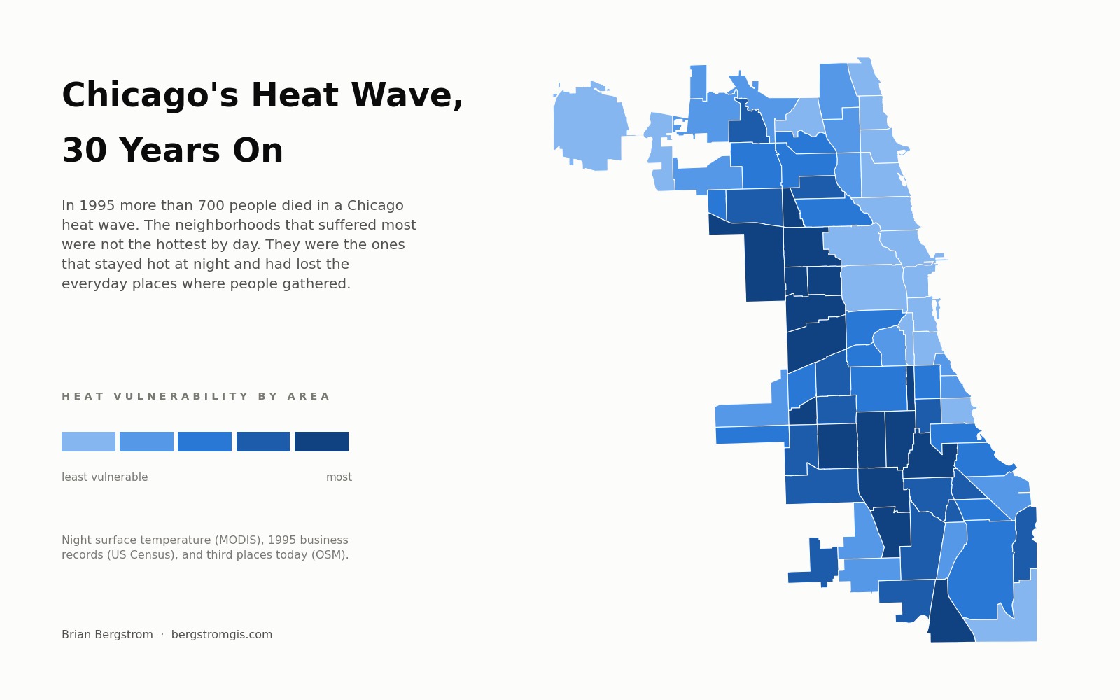
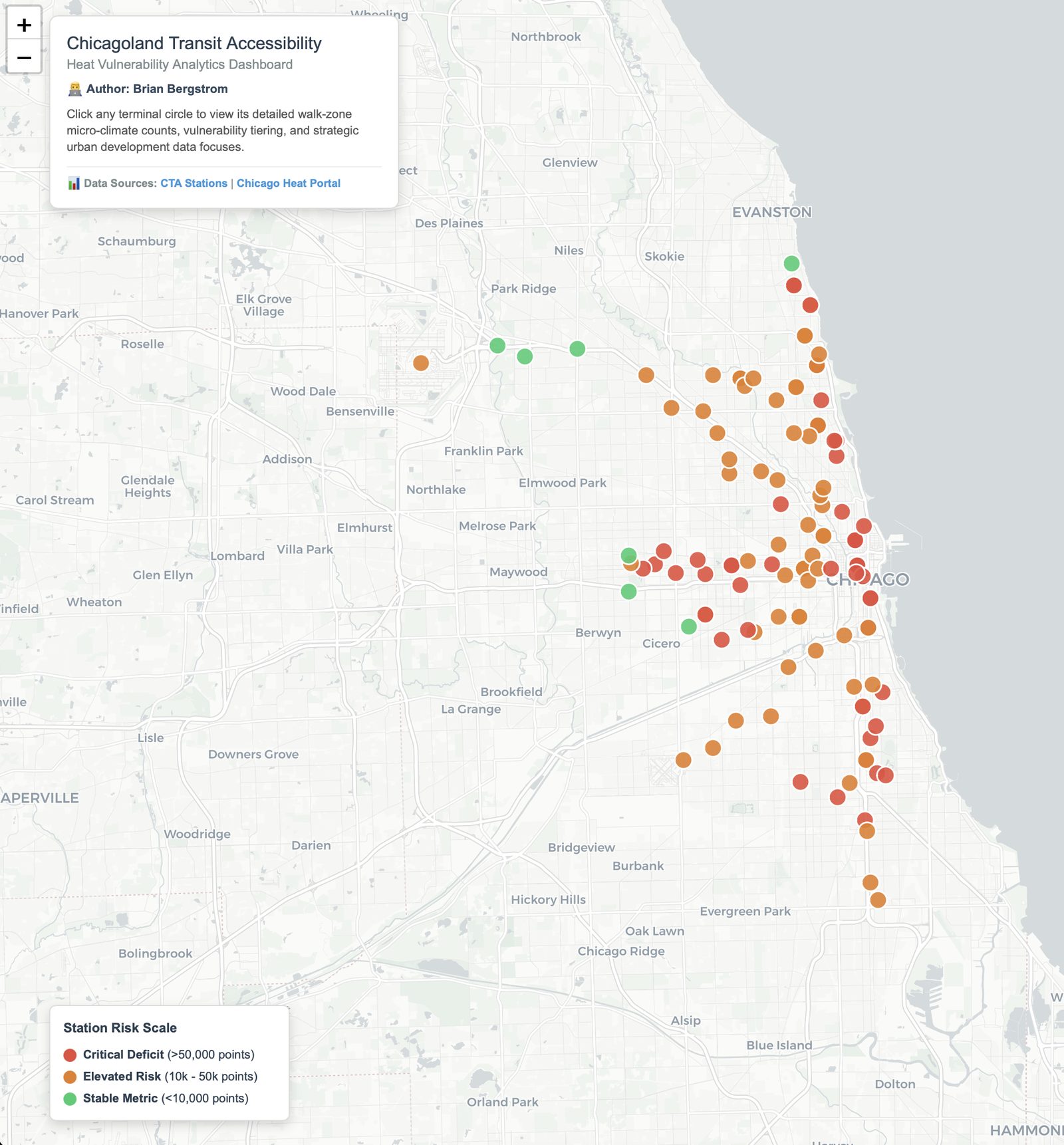
Read the storyA dashboard rating CTA stations by heat vulnerability in walkable zones, layering climate and demographic data.
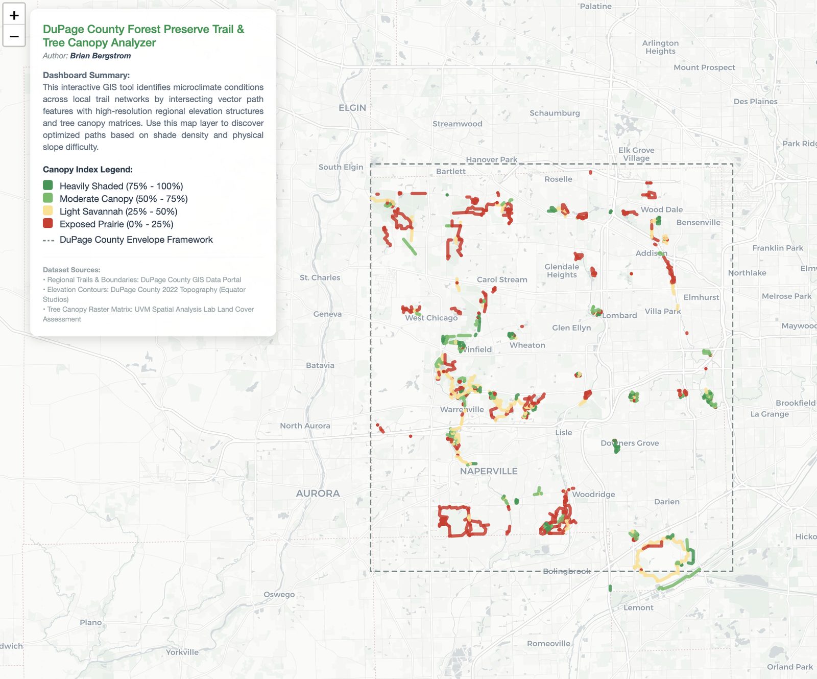
Read the storyAnalyzes canopy cover and trail elevation across DuPage County Forest Preserves to find the shadiest walking routes.
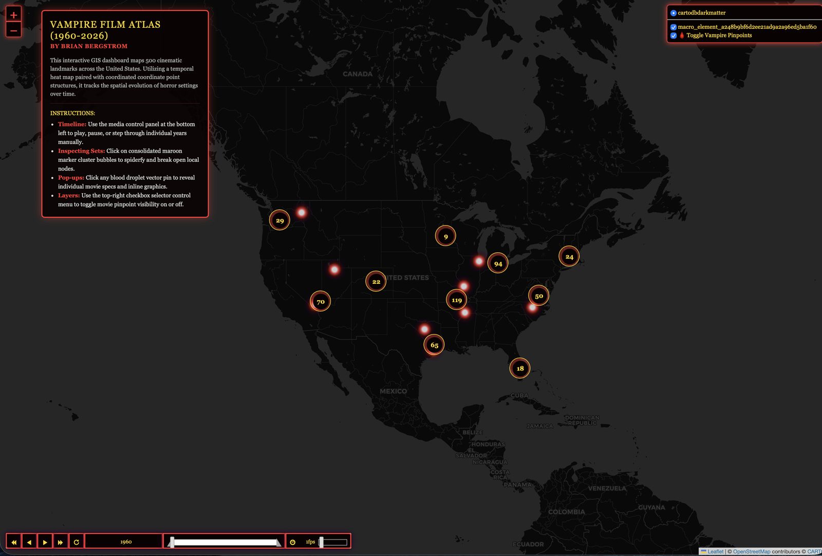
Read the storyA temporal heat map of roughly 500 vampire and horror film locations across the U.S., 1960-2026.
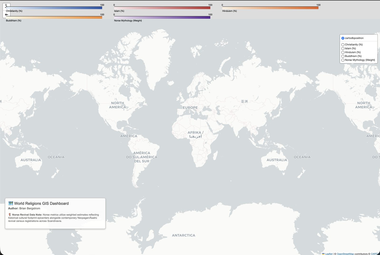
Read the storyA map of global religious distribution, with particular methodological care on Norse/Neopagan Ásatrú data.
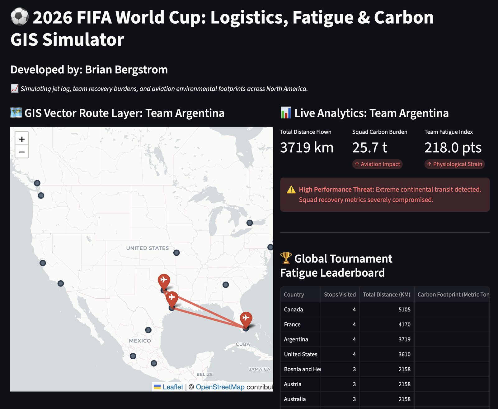
Read the storyTracks player and team fatigue across the 2026 World Cup, combining travel distance with days of rest between matches.
Read the storyNo posts match your search or selected date.