GIS that makes the overlooked undeniable.
Real maps, real data, real people who needed someone to notice. New ones posted here roughly every week.
Chicago's Hidden Access Divide
A April 2026 PLOS ONE study found that walkable access to services and a well-connected street network don't always go together, and that the gap between them splits into distinct failure modes. Chicago wasn't one of the 92 cities the study covered, so I ran their method here myself.
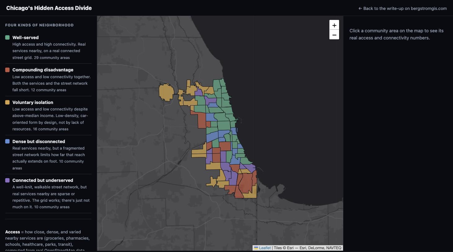
A paper published April 1, 2026 in PLOS ONE (Lai et al.) modeled 92 cities worldwide as street-network graphs, then measured two things separately for every neighborhood: how close, dense, and varied the nearby services are (the "15-minute city" idea), and how well-connected the street network itself actually is on foot. Their finding is more interesting than the obvious one. Good access and good connectivity don't always travel together, and where they split apart, they split in two different directions: some lower-income neighborhoods get both poor access and poor connectivity at once, a compounding disadvantage, while some higher-income neighborhoods show what the authors call "voluntary isolation," genuinely poor access and connectivity despite having the money to have neither, essentially low-density, car-oriented form by choice.
Chicago wasn't in their 92 cities. So I rebuilt their method here: pulled Chicago's actual walkable street network and real points of interest (grocery stores, pharmacies, schools, healthcare, parks, transit) from OpenStreetMap, computed the same three access metrics and a network-connectivity measure along real walking distance, not straight-line distance, and checked the result against real Census income data by community area.
The map matches the city I actually know
O'Hare comes back as the single most extreme case of voluntary isolation in the entire city, which makes complete sense: it's mostly airport land, high income by the numbers, and almost nothing to walk to. Right behind it are the neighborhoods every Chicagoan already thinks of as the city's "suburb inside the city limits": Edison Park, Forest Glen, Norwood Park, Mount Greenwood, Beverly. Higher income, lower density, real distance between real destinations. On the other side, Austin, West Garfield Park, Chatham, and Riverdale (one of the poorest community areas in the city, median household income under $36,000 by this data) land in compounding disadvantage: both weaker access and a thinner street network, together.
Ten community areas, including Pilsen (Lower West Side), Little Village (South Lawndale), and Fuller Park, come back "dense but disconnected": real services genuinely nearby, but a fragmented street network limits how far that reach actually extends on foot. Fuller Park in particular is hemmed in by rail yards on multiple sides in real life, which is exactly the kind of barrier this metric is built to catch and a simple "how many stores are nearby" map would miss entirely.
Where I deviated from the original paper, and why
The original study used a network community-detection algorithm (Infomap) to find "natural" neighborhoods from the street graph itself. I aggregated to Chicago's own 77 official community areas instead, since they're the geography every Chicagoan already navigates by. Computing true global closeness centrality on a 319,517-node graph also isn't practical on a laptop, so I used each node's local network reach, how many intersections are actually reachable on foot within about 15 minutes, as a direct, defensible stand-in for connectivity. And the connectivity estimate for three small community areas (Montclare, Fuller Park, Burnside) rests on fewer than 20 sampled street-network nodes; the map flags those explicitly rather than presenting them with the same confidence as the rest.
Explore all 77 community areas and their real access and connectivity numbers.
View the map (opens in a new tab) View the code (opens in a new tab)