GIS that makes the overlooked undeniable.
Real maps, real data, real people who needed someone to notice. New ones posted here roughly every week.
Where Predictors of Crime Change Across Chicago
A 2025 study found that the things that predict crime in a city aren't the same everywhere in that city — they shift from neighborhood to neighborhood. I rebuilt their approach on real, more current Chicago data to see exactly where and how that shift happens.
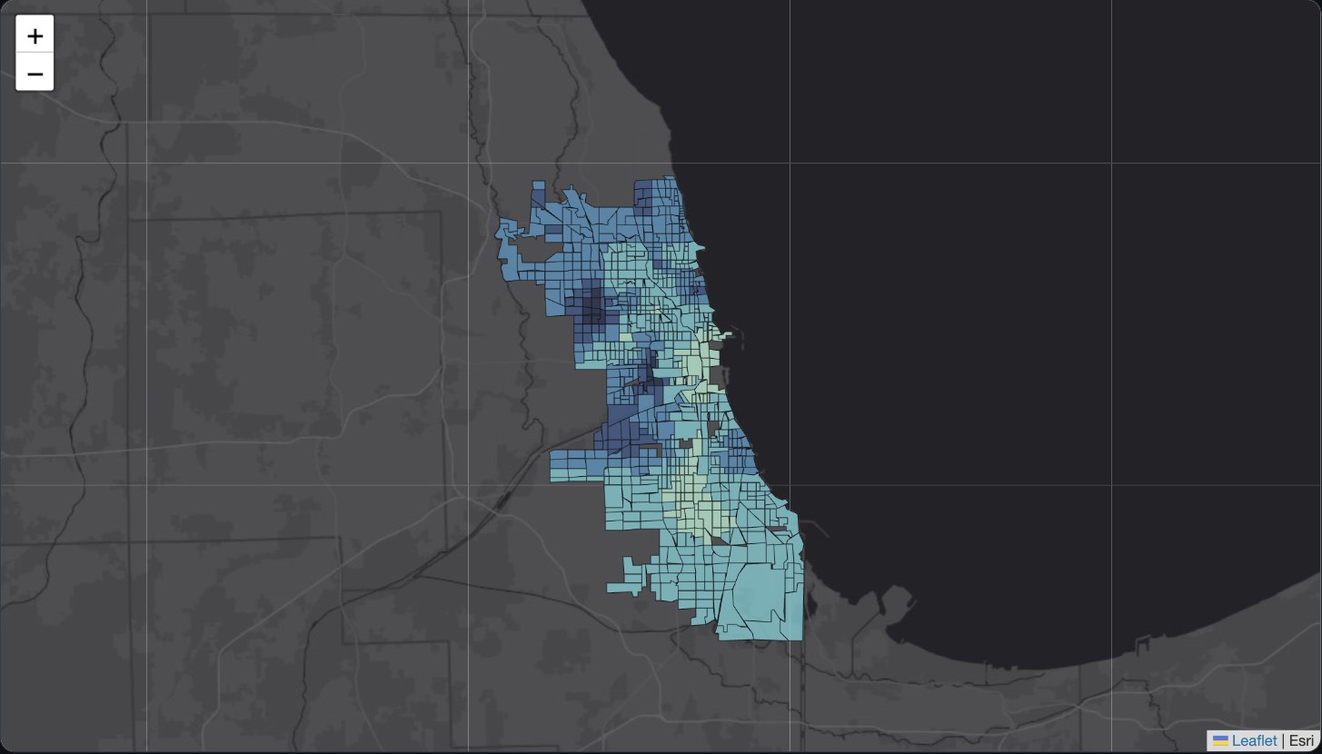
Most attempts to predict crime give you one answer for the whole city: "more of X tends to mean more crime," treated as equally true everywhere. Cai (2025, PLOS One, "Advancing urban management") did something different: instead of one citywide answer, the method works out a separate answer for every neighborhood, based on what's actually happening nearby. So instead of a single number, you get a map. It shows exactly where each factor matters a lot, where it barely matters, and where it points in the opposite direction than you'd expect. The original study used real Chicago crime data through 2023; I rebuilt the same approach on more current real data, 2023–2025.
The real numbers behind this: 389,334 actual crime reports from the City of Chicago, covering three kinds of crime (theft, criminal damage, and battery), spread across all 777 Chicago neighborhoods (census tracts) with complete data. Four real factors were tested against each crime type: how many housing units are in the area, how walkable it is, how many jobs are nearby, and how many businesses and amenities are nearby. Before trusting any of it, I ran two sanity checks. First, made sure none of the four factors were basically measuring the same thing twice under different names (they weren't). Second, confirmed that crime really does cluster into real patterns across the city rather than being scattered at random (it does, clearly, for all three crime types) — which is what justifies looking at this neighborhood by neighborhood instead of settling for one citywide average.
The model explains a lot, but not equally everywhere
All three crime types were explained well by these four factors, correctly accounting for roughly 80% of what's going on with theft, criminal damage, and battery citywide. But "well" isn't even across the city, and that's the whole point of doing it this way. The map shows coverage is strongest on the North Side and through the central corridor, and weaker on parts of the South Side and far Southwest Side. In those areas, these four factors don't tell the full story, meaning something else is driving crime there that this data doesn't capture, a real, honest gap rather than something papered over.
Take housing density. Near downtown, more housing (more people in apartment buildings, packed closer together) is linked to less theft, likely because dense buildings tend to come with more security and more people around to notice something happening. Move further out from downtown, and that same relationship flips: more housing is linked to more theft. A citywide-only analysis would average these two opposite real patterns into one meaningless number. Looking at it neighborhood by neighborhood is what reveals both patterns actually exist, in different parts of the same city.
Where I made a different choice than the original study, and why
The original researchers used an estimate of each neighborhood's greenhouse-gas emissions as a stand-in for "how much activity happens here" (more activity and traffic generally means more opportunity for crime). That estimate requires pulling a massive federal dataset that wasn't practical here. Instead, I used real job counts per neighborhood as the activity stand-in — more jobs nearby generally means more people passing through, and it's a well-established substitute for the same idea in this same field of research. I also checked two more real things the original study looked at, but kept outside the main model, same as they did: how dense the street network is, and how many vacant or abandoned buildings are nearby. One real, specific finding there: vacant buildings are strongly linked to criminal damage and to battery, but barely linked to theft at all, suggesting they matter a lot for some kinds of crime and not much for others.
Switch between crime types and layers, and click any tract for its exact local numbers.
View the map (opens in a new tab) View the code (opens in a new tab)