GIS that makes the overlooked undeniable.
Real maps, real data, real people who needed someone to notice. New ones posted here roughly every week.
Where Humanitarian Mapping Happens
I started mapping for the Humanitarian OpenStreetMap Team about 2 months ago, mostly in Syria, and wanted to know what I had joined. Joining every project in the Tasking Manager against every UN humanitarian appeal shows that volunteer mapping follows the size of an emergency up to a point, and then stops.
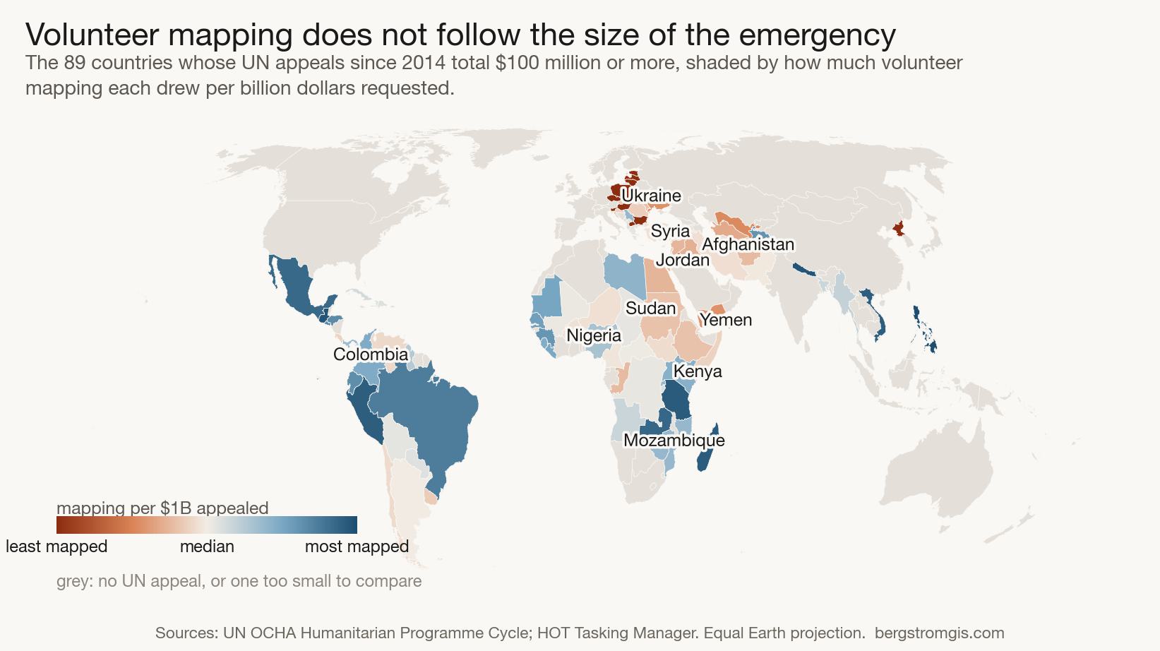
2 months ago I claimed my first task square. It was in Syria, and the job was to trace buildings. Not because a building is interesting on its own, but because counting buildings is how you estimate how many people are in an area, and therefore how many are affected. You draw what the satellite shows, you release the square, and somebody more experienced checks your work afterwards. The whole thing is deliberately built so a beginner can be useful in an afternoon, which is the only reason I was able to start at all.
A fair number of squares turn out to be empty. Open farmland, no buildings, no roads, nothing to draw at all. You mark the square as having nothing in it, and that counts as finished. Then you take the next one.
That detail came back to me later, when I was staring at countries with no mapping in them. In the Tasking Manager, a square somebody opened and found empty and a square nobody has looked at yet are two different states. On the map that comes out of the other end, they are the same blank space.
Being new turned out to be its own kind of question. I could tell whether my own squares were any good. I had no idea what I had actually joined, or where any of this ends up once you add it all together.
So I looked. The Tasking Manager, which is the tool HOT uses to break mapping into squares that volunteers can claim, has a public API. Every project since 2013 is in there, along with how many people worked on it. The UN publishes something comparable from the other direction: every humanitarian response plan it has issued, which country it covers, and how much money it asked for.
Put those two together and you can ask a fairly blunt question. Volunteer attention is finite. Does it go where the need is?
What is in the data
14,510 mapping projects across 160 countries, from 2013 to the present, representing 1,405,270 project participations. That last number needs a caveat straight away: the Tasking Manager counts contributors per project, so a volunteer who maps five projects is counted five times. It is not a headcount, and it is not a measure of effort either. One participation might be 5 buildings traced in ten minutes, or several hundred over weeks. I call it a project participation throughout rather than pretend it is firmer than that.
On the other side, 532 UN humanitarian response plans covering 111 countries since 2014, asking for roughly 400 billion dollars between them.
The finding
Across the whole range, mapping does follow money. Countries with bigger appeals get more volunteer mapping, and the correlation is strong and clearly significant.
Then you look only at the large emergencies, and it stops. Among the 36 countries that have appealed for a billion dollars or more since 2014, the relationship between the size of the appeal and the amount of volunteer mapping is gone. The correlation is slightly negative and nowhere near significant.
Syria has asked for 39 billion dollars and drawn 11,949 project participations. Yemen has asked for 36 billion and drawn 2,943. Honduras has asked for 1.1 billion and drawn 28,512, most of them in a single year. Ukraine, through the largest displacement crisis in Europe since the Second World War, has 10 mapping projects in the Tasking Manager. Not 10 in a bad year. 10 in total, ever.
What that shape describes is a ceiling. Volunteer mapping scales with the emergency up to a point and then saturates, which means the very largest crises are precisely the ones where volunteer effort covers the smallest fraction of what is needed.
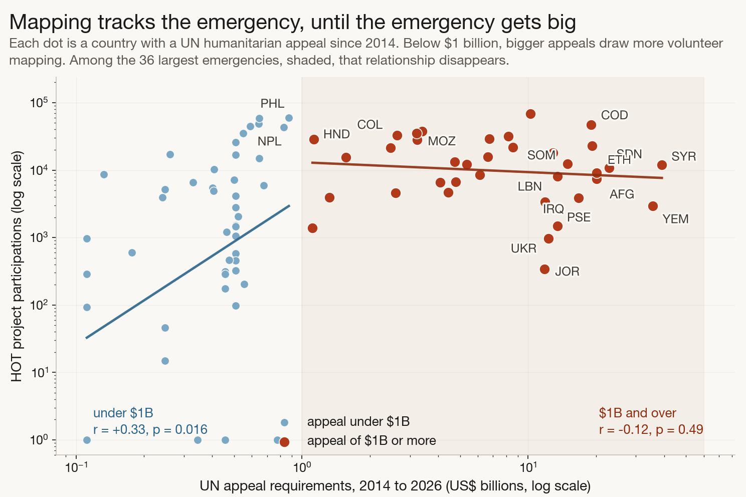
Each dot is a country. Below a billion dollars the trend line rises, so bigger appeals do draw more volunteers. Inside the shaded band, among the largest emergencies in the world, the line goes flat.
How concentrated it is
The top 20 countries account for 60 percent of all project participations. The least-mapped half of the 160 mapped countries account for 3.2 percent between them. And 63 countries that have never had a UN appeal at all still hold 16 percent of the total effort, which is a reminder that a good deal of this work is long-run development mapping rather than emergency response, and was never meant to track appeals in the first place.
The explanation I was confident about, and could not support
My first instinct was that this is a conflict problem. Volunteers turn out for earthquakes and floods, where the damage is visible from orbit and bounded in time, and stay away from wars, where mapping buildings can amount to producing targeting data and where nobody can safely check the work on the ground. Ukraine and Syria seemed to make the case on their own.
OCHA labels every appeal with a plan type, so there is a way to test that without me sorting countries into buckets myself, which would have let me find whatever I went looking for. Flash appeals are sudden onset. Response plans are protracted crises. Regional plans are for people who have already fled somewhere else.
Sudden-onset emergencies do draw more mapping per dollar than protracted ones. But the difference is not statistically significant, and the share of appeals drawing any mapping at all is 80 percent against 78 percent, which is no difference worth discussing.
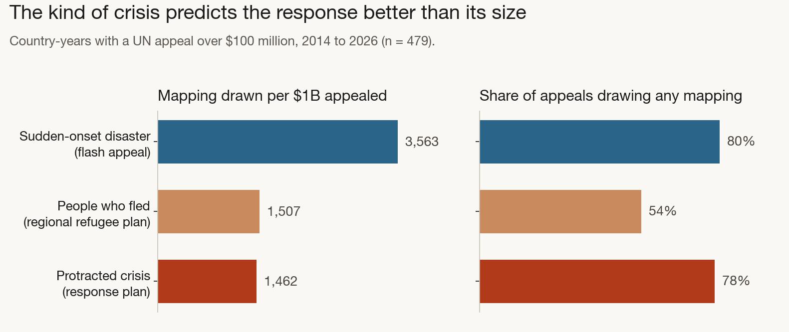
Sudden-onset emergencies draw more mapping per dollar, but 25 flash appeals is a small sample and the difference does not clear significance. The refugee-plan gap in the right-hand chart is the one that looked convincing until high-income countries came out of it.
Refugee-hosting appeals looked like a much stronger result, with barely half drawing any mapping. That one fell apart when I looked harder. The regional refugee plans include Poland, Hungary, Czechia and the Baltic states, wealthy countries hosting Ukrainian refugees whose maps have been complete for years. They are not evidence of neglect. Dropping high-income countries took the result from convincing to not significant.
So the tidy version of this story is not in the data, and I have left the failed test in the repository next to the ones that worked. The saturation finding survives all of that. The explanation for it does not come from this dataset, and I would rather say so than reach.
A note on getting the dates
The Tasking Manager will not tell you when a project was created unless you ask for that project specifically, and each of those replies is about 90KB. Doing that 14,702 times means pulling well over a gigabyte off a nonprofit's API to read one field, which is a rude way to run a hobby project.
Project IDs are handed out in order, so I sampled 204 real creation dates spread across the whole range of IDs, confirmed the relationship never runs backwards, and interpolated everything else. To check it, I pulled 60 more projects the fit had never seen. Median error 0.33 days, worst case 5.5 days, which is far more precision than a question measured in years requires.
What I would not claim from this
The Tasking Manager is not all humanitarian mapping. Bilateral projects, partner work and national mapping agencies do not appear in it, and a country can be well mapped through channels this data cannot see.
I did look at whether logged mapping time would be a better measure of effort than counting participations, since the API exposes it per project. Not quite. A task stops logging your time after two hours while it carries on counting the buildings and roads you draw, so recorded time under-reports anything worked on in one long sitting. I know that because it has happened to me. Both measures are rough in different directions, and neither changes the shape of the finding.
Appeal dollars are also a rough proxy for how much a place needs a map. Indonesia is the clearest case: a 50 million dollar appeal against 77,265 project participations, because middle-income countries with real disaster agencies handle their own earthquakes without asking the UN for money. Countries appealing for under 100 million dollars are held out of the per-dollar comparisons for that reason.
None of this is a complaint about the volunteers. It is a description of what a volunteer system does when it meets an emergency larger than volunteering can absorb, which seems worth knowing if you are one of the volunteers.
The harvest, the statistics including the hypothesis that failed, and the figure code are all in the repository.
View the code (opens in a new tab) HOT Tasking Manager (opens in a new tab)