GIS that makes the overlooked undeniable.
Real maps, real data, real people who needed someone to notice. New ones posted here roughly every week.
Chicago's Heat Wave, 30 Years On
In July 1995, more than 700 people died in a Chicago heat wave. The sociologist Eric Klinenberg argued the deaths were social rather than meteorological. I tested that claim with satellite thermal imagery and business records from 1995, and found the neighborhoods that suffered most were not the hottest by day.
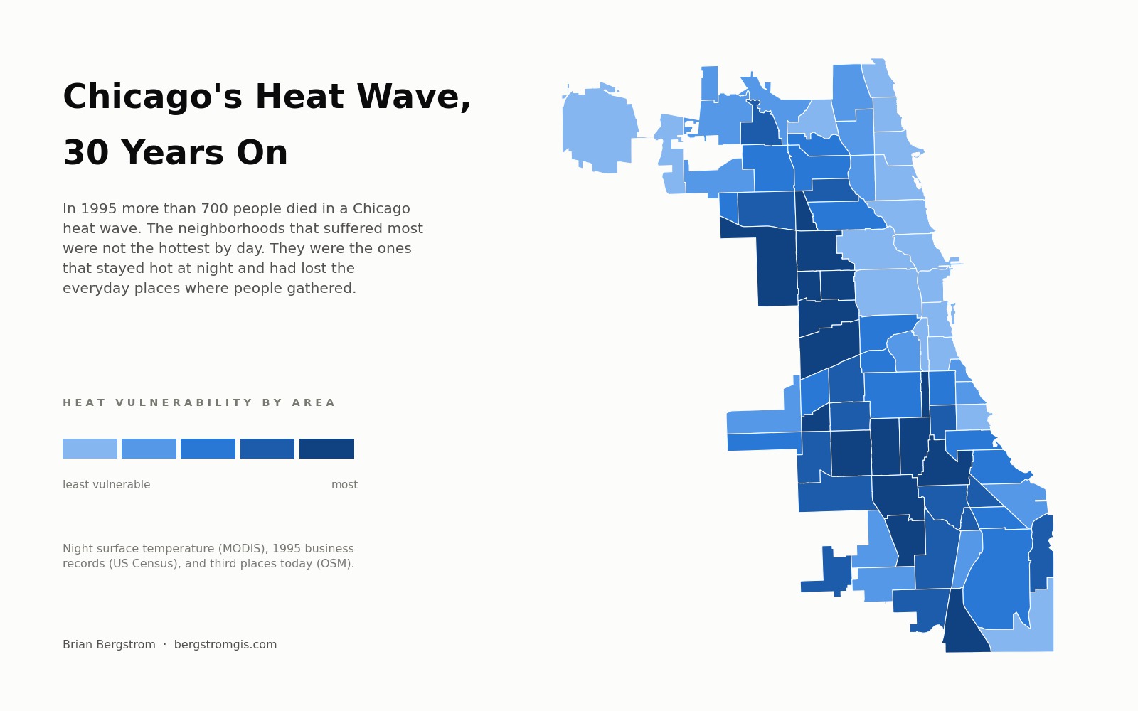
Between July 13 and July 20, 1995, Chicago hit 106 degrees. The Cook County Medical Examiner certified 465 heat related deaths in that week, and researchers later put the number of excess deaths closer to 700. Almost all of the victims were elderly, and most died indoors and alone.
The obvious explanation is that some neighborhoods were simply hotter than others. In his book Heat Wave, the sociologist Eric Klinenberg argued for something different. He compared two adjacent West Side neighborhoods with similar poverty rates and very different death rates, and concluded that what protected people was ordinary social contact. Where there were busy shops, restaurants and churches, older residents had reasons to leave the house, and neighbors noticed when they stopped showing up.
Thirty years on, there is data available now that nobody had then. I wanted to know whether his geography still holds, and whether a satellite can see it.
The problem with mortality data
There is no public record of where people died in 1995 at the neighborhood level. Records that detailed are not released, and Cook County's open medical examiner archive only begins in 2008. Modern heat deaths are too few to model: 62 in the whole county since 2015, and only 45 with a neighborhood attached.
So this project does not model deaths. It measures the two things Klinenberg said mattered, and asks whether they line up with the geography the historical record already describes. That turns out to be a stronger test than it sounds, because the two measurements come from completely independent sources and neither one knows anything about 1995 mortality.
The finding I did not expect
Landsat satellites measure surface temperature at about 10:30 in the morning. By that measure, the hottest parts of Chicago are the bungalow neighborhoods on the Southwest and Northwest sides, and the neighborhoods that suffered most in 1995 look unremarkable. Washington Park came out as the ninth coolest community area in the city.
That is a real measurement, and it is also the wrong one. Lake Michigan keeps the lakefront cool during the day. But heat does not kill people at 10:30 in the morning. It kills when buildings hold their heat overnight and the body never gets a chance to recover.
Switching to a satellite that passes over at 1:30 in the morning reverses the picture. North Lawndale moves from 41st hottest to 2nd. East Garfield Park moves from 44th to 3rd. Washington Park moves from 69th to 16th. Daytime and nighttime temperature agree only about half the time, and it is the nighttime map that matches where people actually died.
Thirty years of commercial geography
For 1995 I used the Census Bureau's ZIP Code Business Patterns, which counts establishments by industry code and reaches back to 1994. Restaurants and bars are as close as public data gets to "places where people gather." For today I used OpenStreetMap's record of cafes, libraries, community centres and social facilities.
Chicago's commercial geography has barely moved. Where there were bars and restaurants in 1995, there are cafes now, and where there were not, there still are not. The relationship is about 0.7 on a scale where 1.0 would be a perfect match. Klinenberg was not describing a moment that has since passed. The pattern he identified is still in place.
Why both maps are needed
Heat and social infrastructure turn out to be almost unrelated to each other. Some hot neighborhoods are full of cafes, and some cool ones have almost none. Neither map alone predicts where the 1995 deaths clustered. The overlap does.
Five community areas fall in the worst quarter of the city on all three measures, hot at night, short of businesses in 1995, and short of gathering places today: South Lawndale, West Garfield Park, West Englewood, Chicago Lawn and Austin. About 7,000 residents over 65 live alone in those five areas.
The obvious objection
OpenStreetMap is built by volunteers, so a neighborhood can look empty simply because nobody mapped it. If volunteer mapping were thinnest in poor neighborhoods, this whole analysis would be measuring mapping effort rather than real amenities.
I checked, using the share of buildings in each area that carry a street address in OpenStreetMap as a measure of how thoroughly it has been surveyed. The neighborhoods this finding depends on are mapped as well as or better than the city average. West Garfield Park sits twelve points above the median. Chicago's least mapped areas are the outlying bungalow belt, not the South and West sides.
What this does not show
No death records appear anywhere in this analysis. This is a map of vulnerability, not of what happened. Its claim to be meaningful is that it independently reproduces a pattern that historians and sociologists documented by other means.
There is also one comparison it cannot make. The two neighborhoods at the center of Klinenberg's argument, North and South Lawndale, share a single ZIP code, so the 1995 business data cannot tell them apart. I measured the gap at 41 percent before interpolation and 5 percent after, which is a difference produced by method rather than by anything real. That specific test needs a different source, and saying so is more useful than picking whichever number looked better.
Switch between night heat, day heat, 1995 commerce and today's gathering places, and click any community area for its full numbers.
View the map (opens in a new tab) View the code (opens in a new tab)