GIS that makes the overlooked undeniable.
Real maps, real data, real people who needed someone to notice. New ones posted here roughly every week.
Reportable Disease Cases Since RFK Jr. Took Over HHS
Real, state-by-state case counts for every disease the CDC requires states to report, tracked against the actual dated timeline of federal vaccine policy changes.
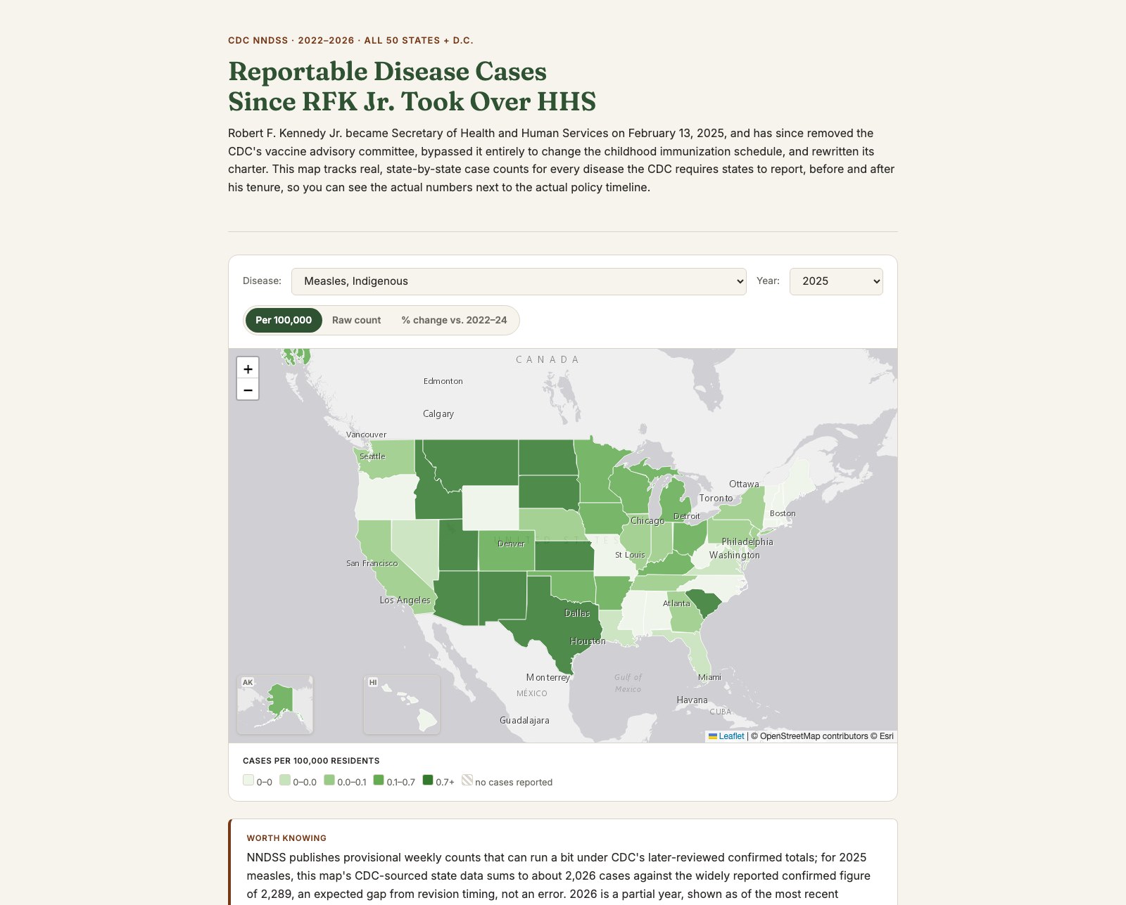
Robert F. Kennedy Jr. became Secretary of Health and Human Services in February 2025 and has since removed the CDC's entire vaccine advisory committee, bypassed it to change the childhood immunization schedule directly, and rewritten the committee's own charter. That's a real, dated, verifiable set of actions, not a claim. What isn't settled is what it means for actual case counts on the ground, state by state, so I built the map that puts both in front of a reader at once instead of asserting a conclusion for them.
Every notifiable disease, not just the convenient ones
It would have been easy to cherry-pick a handful of vaccine-preventable diseases likely to show a dramatic post-2025 spike and leave it there. Instead the map pulls all 139 diseases and conditions CDC's National Notifiable Diseases Surveillance System currently tracks, for every state, every year 2022 through the most recently reported week of 2026. Seven vaccine-preventable diseases most directly relevant to the recent policy changes are highlighted at the top of the picker; everything else NNDSS tracks, from Lyme disease to legionellosis, is still there below them, not filtered out because it doesn't fit the narrative.
Rate, raw count, and percent change, honestly
A per-100,000 rate and a raw case count are both available for every selection, since a public-health audience and a general audience read those numbers differently. A percent-change view compares each state's current count against its own 2022–24 baseline — but a state averaging under 1 case a year in that baseline can turn one new case into a mathematically valid, practically meaningless five-digit percentage. Those states are labeled "new" instead, the same small-count-honesty rule used on my Illinois Mental Health Map, rather than let a stray outlier dominate the map's color scale.
Alaska and Hawaii, actually shown
Both states get real cartographic inset maps in the bottom-left corner, fully interactive and colored by the same live selection as the main map, rather than being cropped out of frame the way a plain Mercator view usually drops them. Alaska's true shape crosses the antimeridian — the westernmost Aleutian tip sits at positive longitude in Census data — which breaks a naive auto-fit and quietly zooms out to fit almost the entire globe, so the inset uses a manually corrected bounding box instead.
NNDSS publishes provisional weekly counts that run a bit under CDC's later, reviewed totals: this map's 2025 measles count sums to about 2,026 cases against the widely reported confirmed figure of 2,289, an expected gap from revision timing, not an error. 2026 is a partial year, shown as of the most recent reported week. A state's case count is shaped by its own vaccination rates, outbreak exposure, and reporting completeness, not federal policy alone, so the map and the policy timeline below it are two real, related facts meant to be weighed together, not a single proven cause and effect. The timeline itself is upfront about the one major 2025 schedule change a federal court actually blocked, not just the ones that took effect.
Pick a disease, a year, or a metric, and read it against the timeline.
View the map (opens in a new tab) View the code (opens in a new tab)