GIS that makes the overlooked undeniable.
Real maps, real data, real people who needed someone to notice. New ones posted here roughly every week.
World Cup Fatigue Dashboard
Tracks player and team fatigue across the 2026 World Cup, combining travel distance between matches with days of rest.
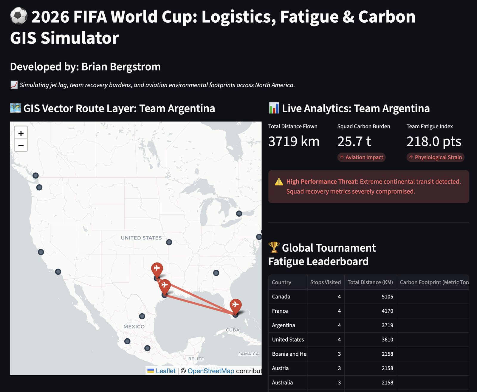
This dashboard models fatigue for teams and players across the 2026 World Cup using two real factors together: the travel distance between matches, and the number of days of rest in between. It's a genuine, specific model, not just a scoreboard dressed up as a map.
This is a personal-interest project, plain and simple — a chance to apply the same geospatial thinking I use in civic work to something I follow purely for fun.
Live dashboard, 2026 World Cup.
View the dashboard (opens in a new tab) View the code (opens in a new tab)