GIS that makes the overlooked undeniable.
Real maps, real data, real people who needed someone to notice. New ones posted here roughly every week.
Chicagoland Transit Heat Vulnerability
A dashboard rating CTA stations across walkable zones by heat vulnerability, layering climate and demographic data.
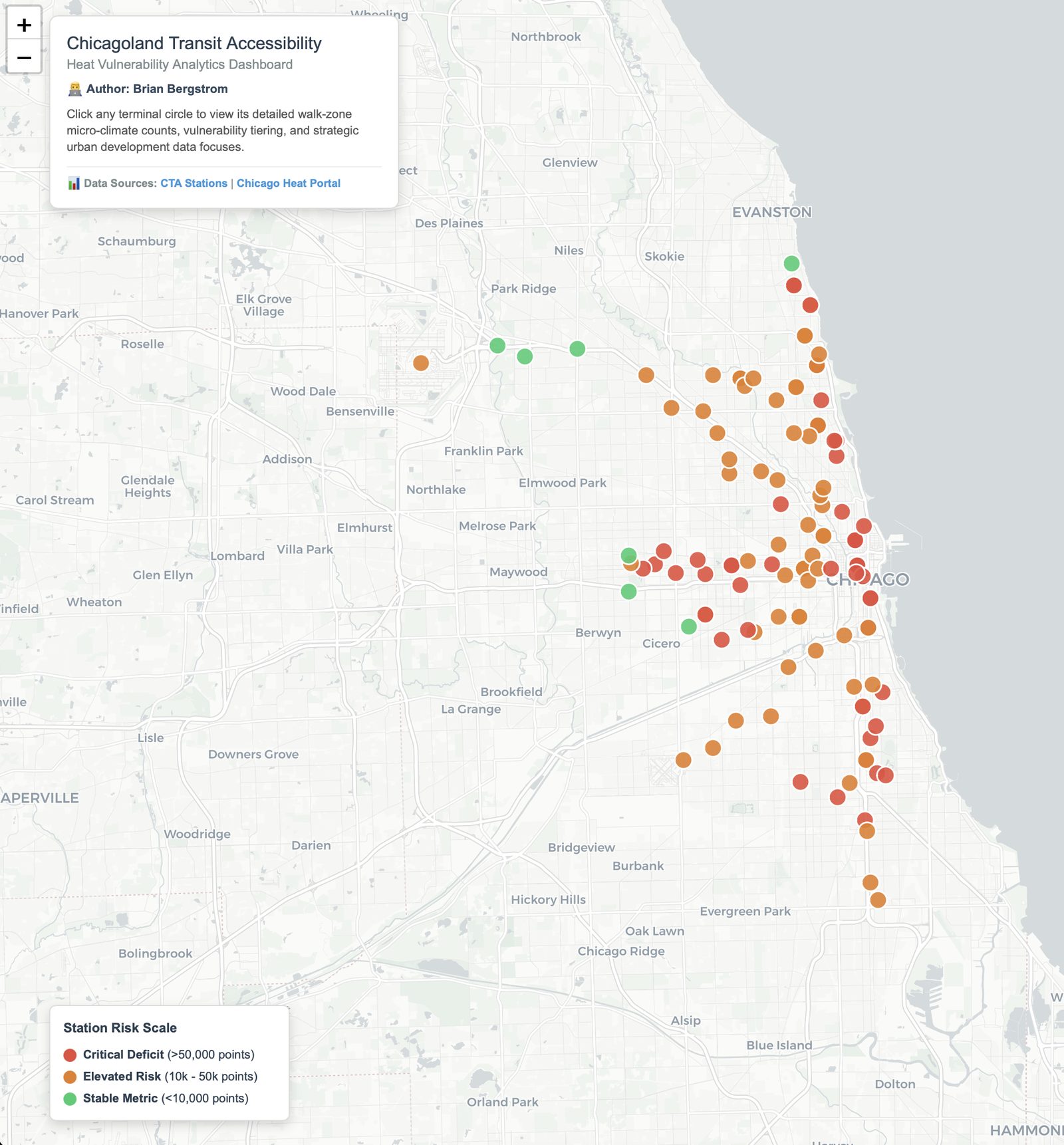
This dashboard scores CTA stations by heat vulnerability across their surrounding walkable zones, combining climate exposure data with the demographics of who actually relies on those stations — the same underlying question as my food-desert work, applied to extreme heat instead of extreme distance.
Where the idea came from
I want to be upfront that this one started differently than most of what I build. Unlike the food-desert work, which comes directly out of my own decades of riding buses and trains, this specific idea was suggested to me by AI rather than pulled from my own lived transit experience. I still think it's a solid execution of a real problem — I just don't want to imply a personal origin story it doesn't have.
Live dashboard, Chicagoland CTA network.
View the dashboard (opens in a new tab) View the code (opens in a new tab)